Thanks to Christoph, he also runs a specific blog on paleoseismicity, who send me the link, I want to share the gizmodo list of best maps 2013 with you. Despite the little US focus (which is a disadvantage of the list) we can see some major trends for 2013/2014:
D3
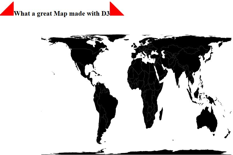
I think, D3 was one of the most interesting players in 2013 as there were so many cool examples of stunning maps and cartographic stuff (like here and here and also Ralfs tutorials. I would love to see more examples on what to do with this Javascript library.
The rise of the mighties
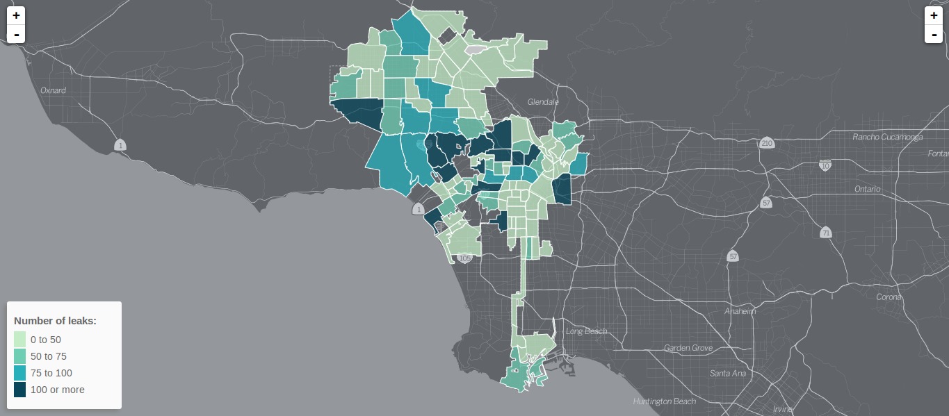
Looking back, we had an interesting focus on the new players on the market: cartoDB, mapbox and all the javascript supporters at leaflet , openlayers and D3… there are some mighty heroes and when it comes to publishing spatial data I feel a little decline of the footprint of the big company from Redland and Mountain View. I like this movement!
Back to beautiful
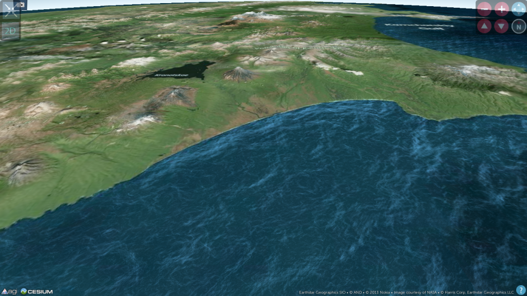
The new maps produced by newspapers, enthusiasts and non-cartographic people have on thing in common: They all see the need to look better than the data is. This means we don’t want to see only data, we want to have some details and some nice stuff: like some new ideas in labeling , usage of transparency and some nice looking hover effects and many other things. The most beautiful and stunning thing I have seen this year was the wave animation on this years NORAD’s Santa Tracker which was done with cesium JS:
To come to an end: 2013 was great! 2014 will be better!
Now it comes to you:
Send us a link with your best map of 2013:


[…] “Thanks to Christoph, he also runs a specific blog on paleoseismicity, who send me the link, I want to share the gizmodo list of best maps 2013 with you. Despite the little US focus (which is a disa…” […]