About four years ago, Daniel wrote a short article on how to publish a GeoTiff as maptiles and how to use this in a leaflet map. I would like to refresh that knowledge and apply this to the current release of the NASA images (“Black Marble 2016”) which were published last week and also compare the images using some LeafletJS magic.
The Black Marble Data
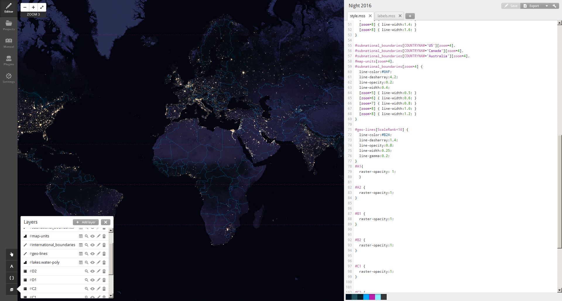
The data itself is delivered by the NASA as eight GeoTiffs with a ground resolution of 500m. Once downloaded you will need to reproject them (Attention: QGIS suggested EPSG 32662 for the original tiffs but believe me: they are in 4326) to Web Mercator (EPSG 3857) so they can be used in Tilemill (which is still great 😉 ). Once you’ve done this, simply add the warped tiff as a layer to your project (I was using the control-room preset) and make sure to choose the SRS 900913 (old EPSG code for Web Mercator). Click save & style and you’re pretty set:
The project in Tilemill
I’ve put the NASA images at the bottom of the composition to have the labels, borders and other line items above it.
Now you can export the data as mbtiles (on my Core i7 with 8GB Ram it took about 45min to render the files for zoom levels three to eight). Once exported you need to convert the mbtiles file into a folder like structure with lots of small pngs inside like you maybe know it from other tile server or you already have a tileserver which can deliver tiles out of a mbtiles file. The tool to use for unpacking was mbutil (also provided by hail-to-the-Mapbox). Now you definitely need to run a server to serve the tiles (could be IIS, Apache or Nginx, just a server 😉 ). Put the tiles there and you’re ready to go!
Creating the Comparison Map for Black Marble 2012 vs. 2016
Once I’ve created tiles for the 2012 scenes and the 2016 scenes I was wondering whether there is a way to blend basemaps in Leaflet using a slider. The base concept consists of two map containers that are connected with each other: Once you move the map in the 2012 map you need to move the 2016 map as well. Same applies to the zoom-in and zoom-out. The slide should increase the size of map container or decrease it so you can see the one “above” the other.
I found only one solution here and it worked quite well. I just changed the slider to be more convenient in terms of the color:
The code itself is quite simple when it comes to the layers themself:
<body>
<div id="map-container">
<!-- Make sure to give the map divs height and width
I do it with the map class -->
<div id="before" class="map"></div>
<div id="after" class="map"></div>
</div>

<script>
var before = L.map('before', {
zoomControl:true,
inertia: false,
center: [51.505, -0.09],
zoom: 3
})
var hash = new L.Hash(before);
var after = L.map('after', {
zoomControl:true,
inertia: false,
center: [51.505, -0.09],
zoom: 3
})
var hash2 = new L.Hash(after);
var basemap0 = L.tileLayer('http://scripts.digital-geography.com/black_marble/2012/{z}/{x}/{y}.png', {
maxZoom: 8,
minZoom: 3,
attribution: "data by Nasa 2012, composition by <a href='http://geolicious.de'>Geolicious</a>"
});
basemap0.addTo(before);
var basemap1 = L.tileLayer('http://scripts.digital-geography.com/black_marble/2016/{z}/{x}/{y}.png', {
maxZoom: 8,
minZoom: 3,
attribution: "data by Nasa 2016, composition by <a href='http://geolicious.de'>Geolicious</a>"
});
basemap1.addTo(after);
$('#map-container').beforeAfter(before, after);
</script>
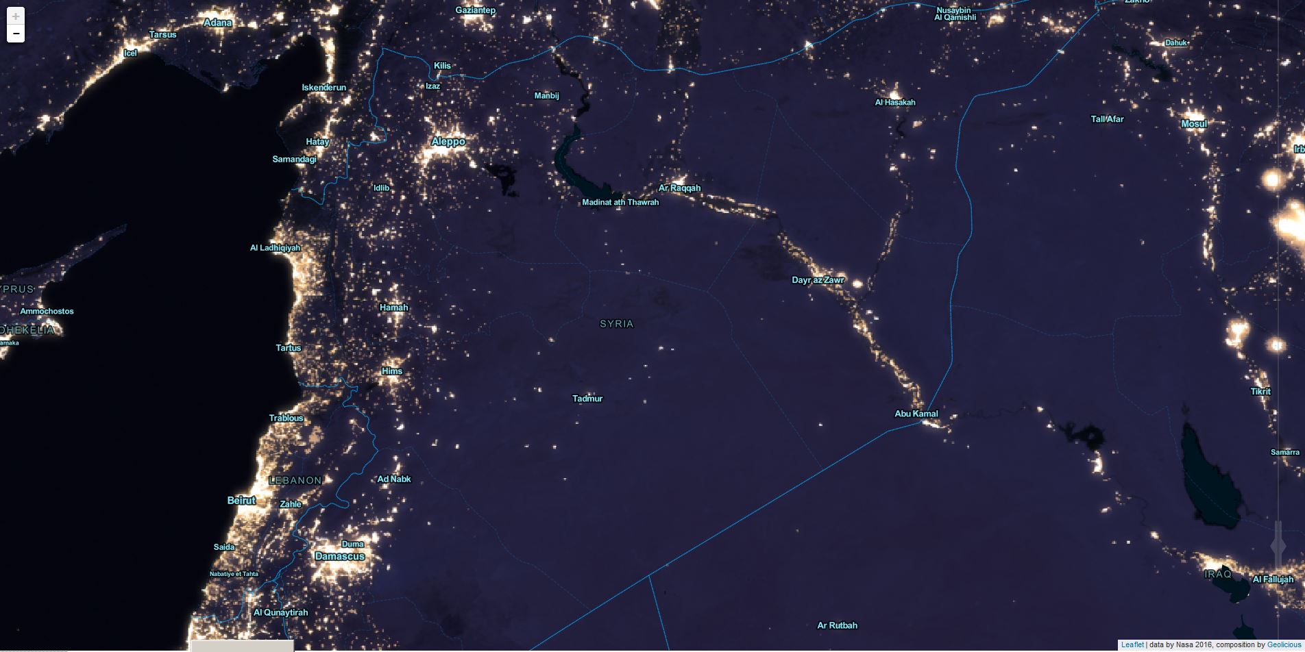
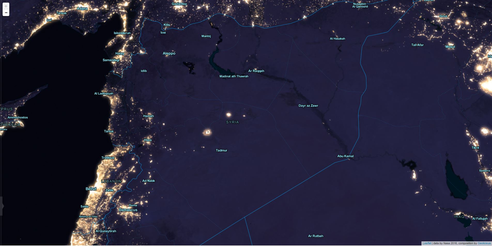
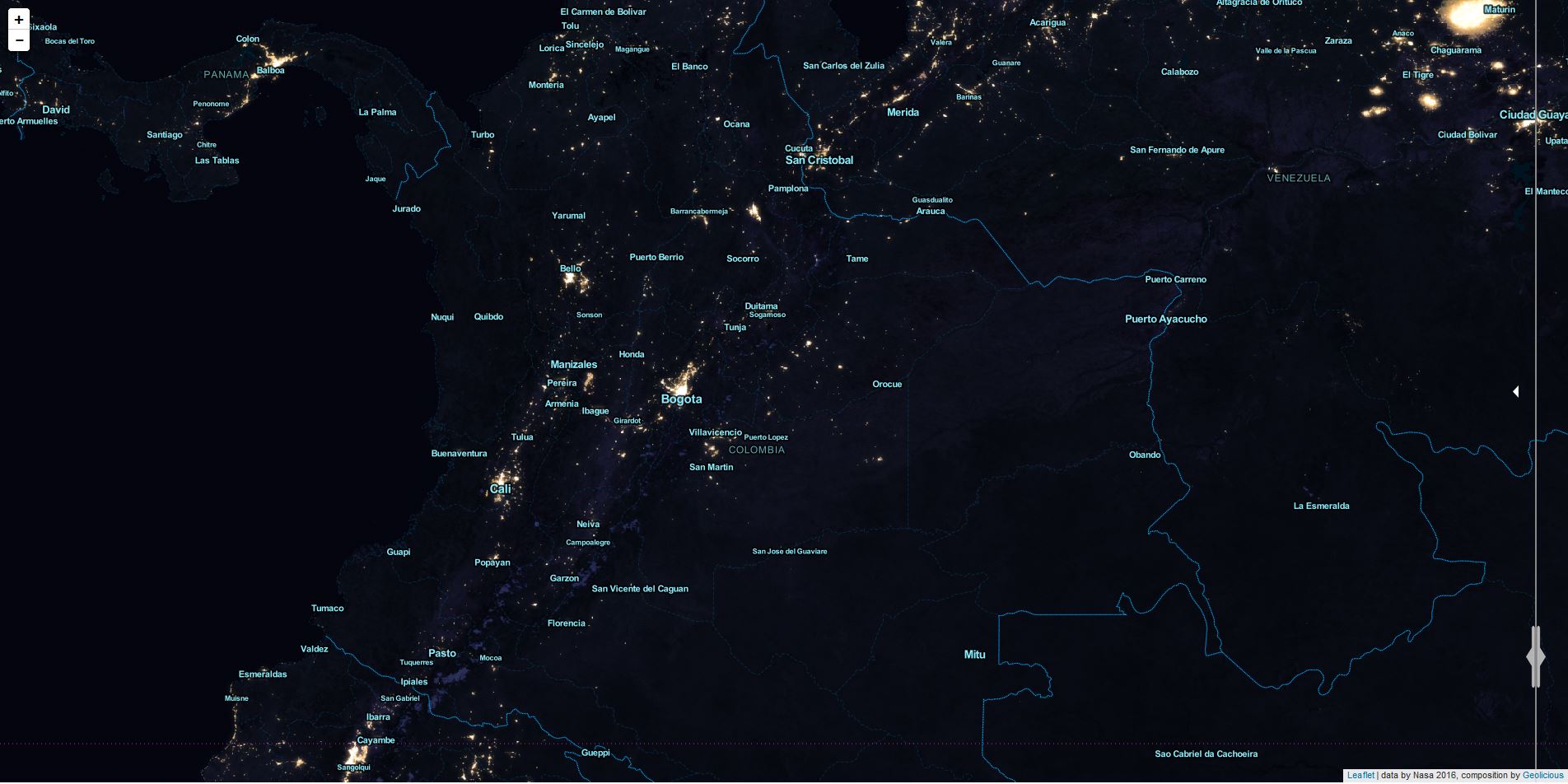
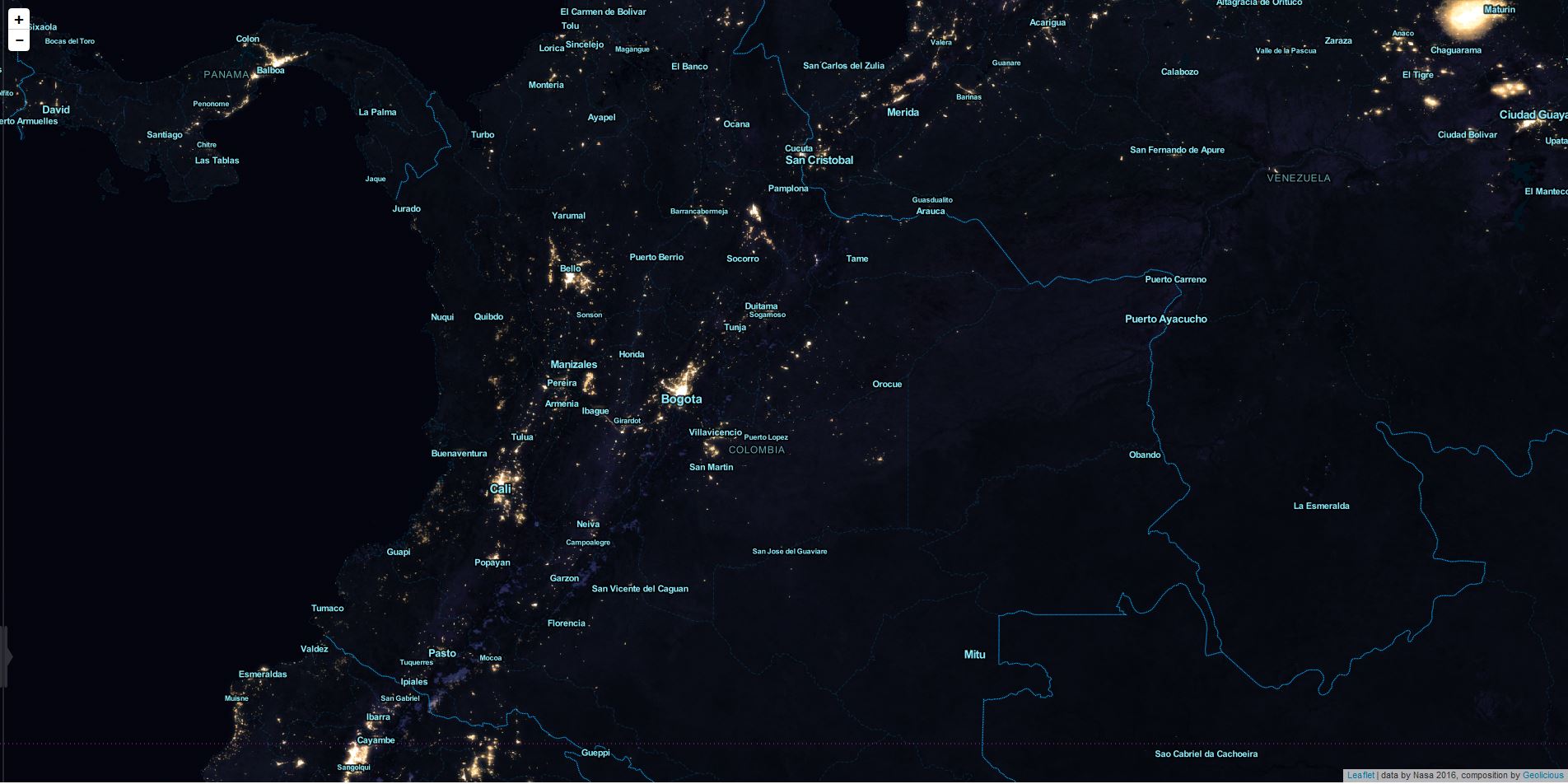
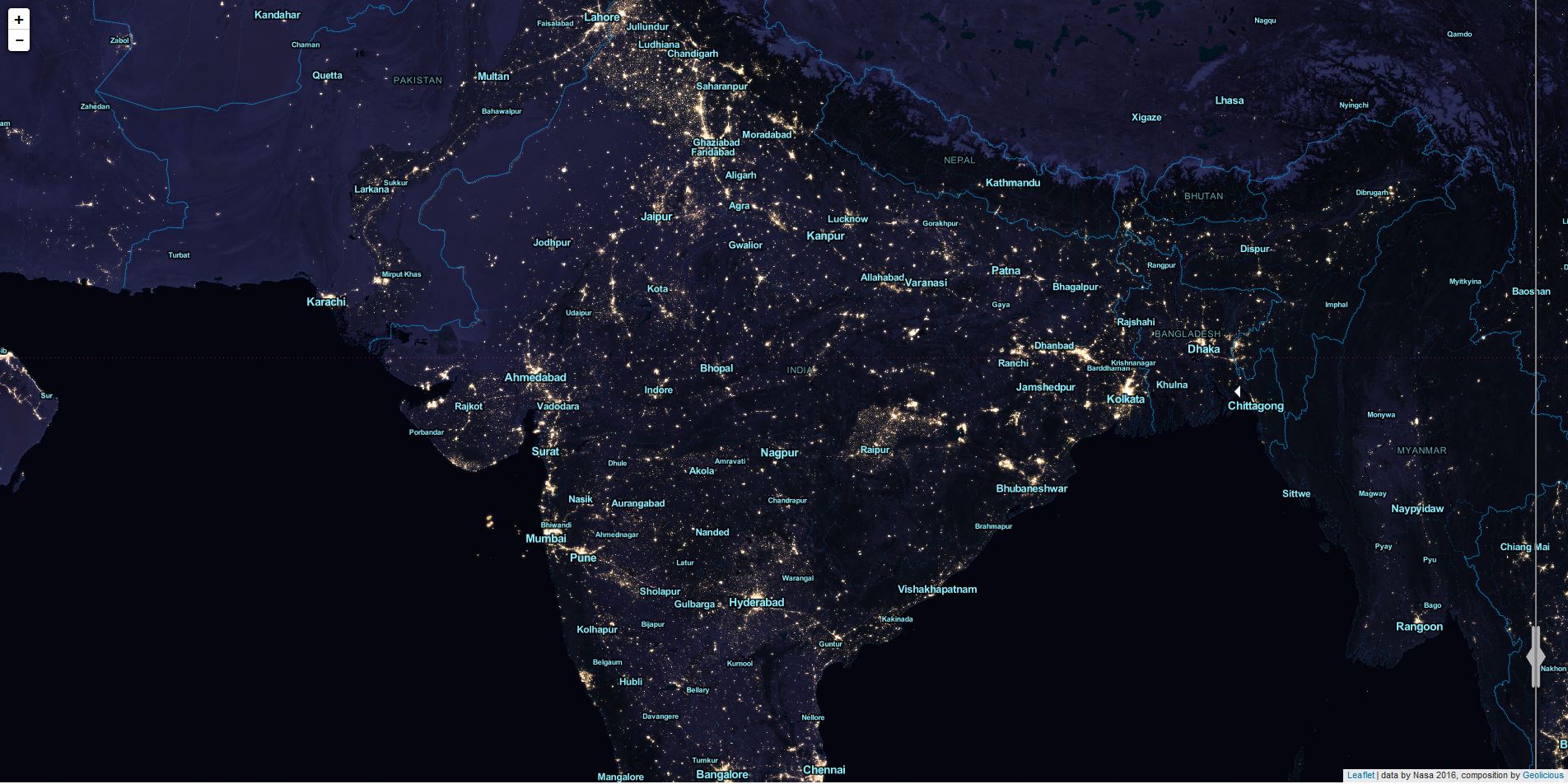
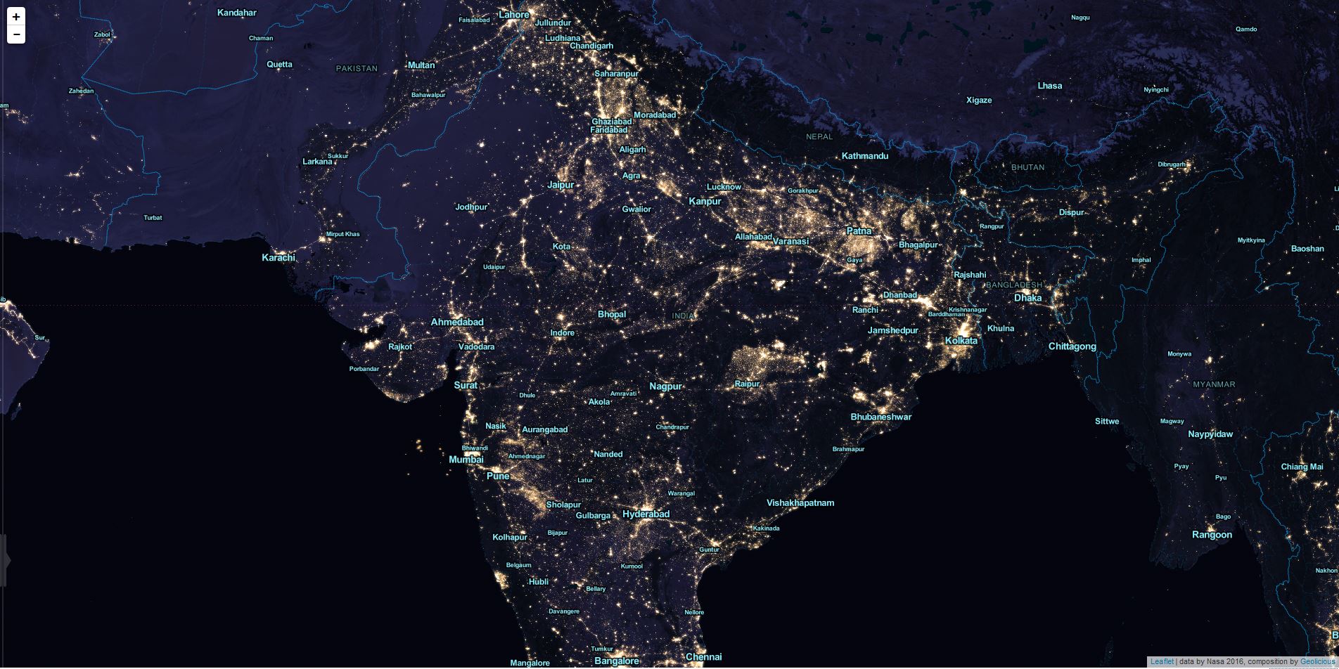
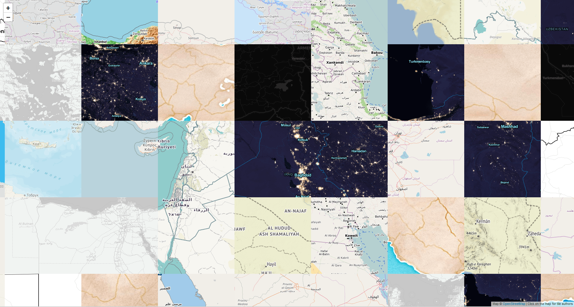
Yet after all the direct view on the map is great as you can see clearly the effects of the war in Syria, electrification efforts of the Indian and Colombian government and something strange in Indonesia:
Choosing a basemap for your cool web map is always crucial for the style and perception of your map. A colorful basemap like watercolor might be stunning but…
Are you back from holiday? Maybe you switched from Casale Monferrato, Piedmont and have used the map of Monferrato Landscapes. If you were lucky, you see a new…
For an upcoming project I was curious about visualizing a line layer using OpenLayers. Therefore I digitized a way with googlemaps. After creating a kml with “my places”…
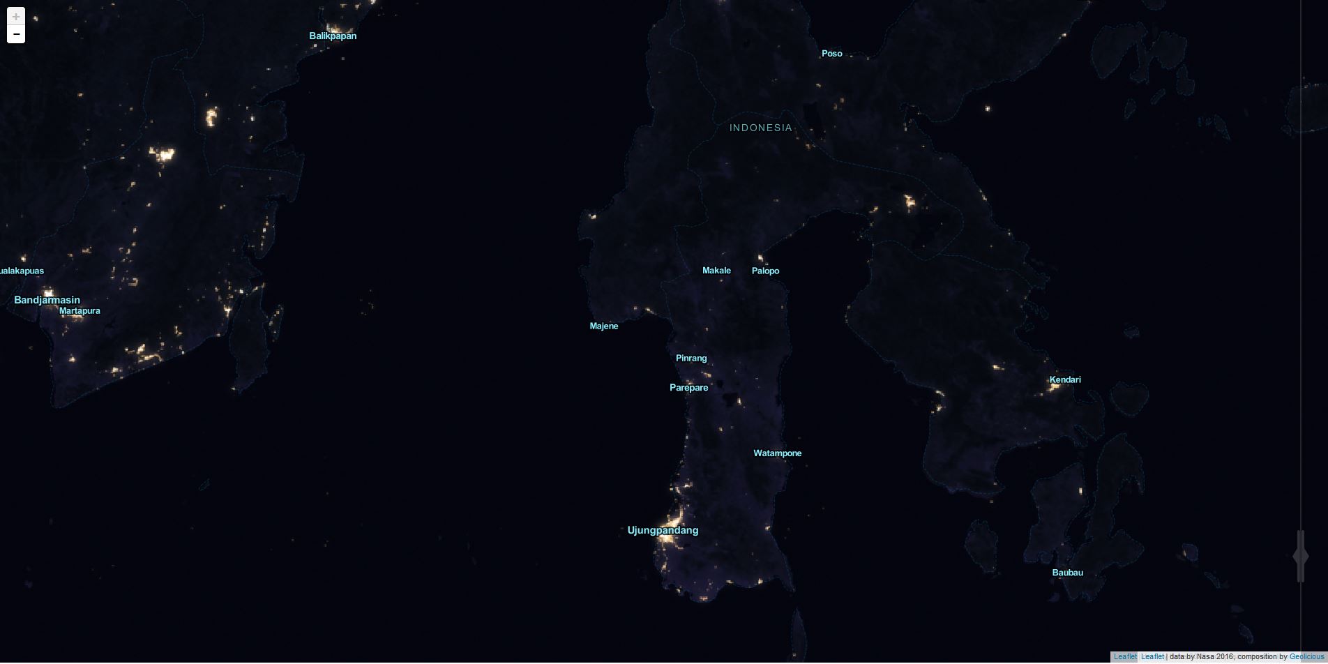
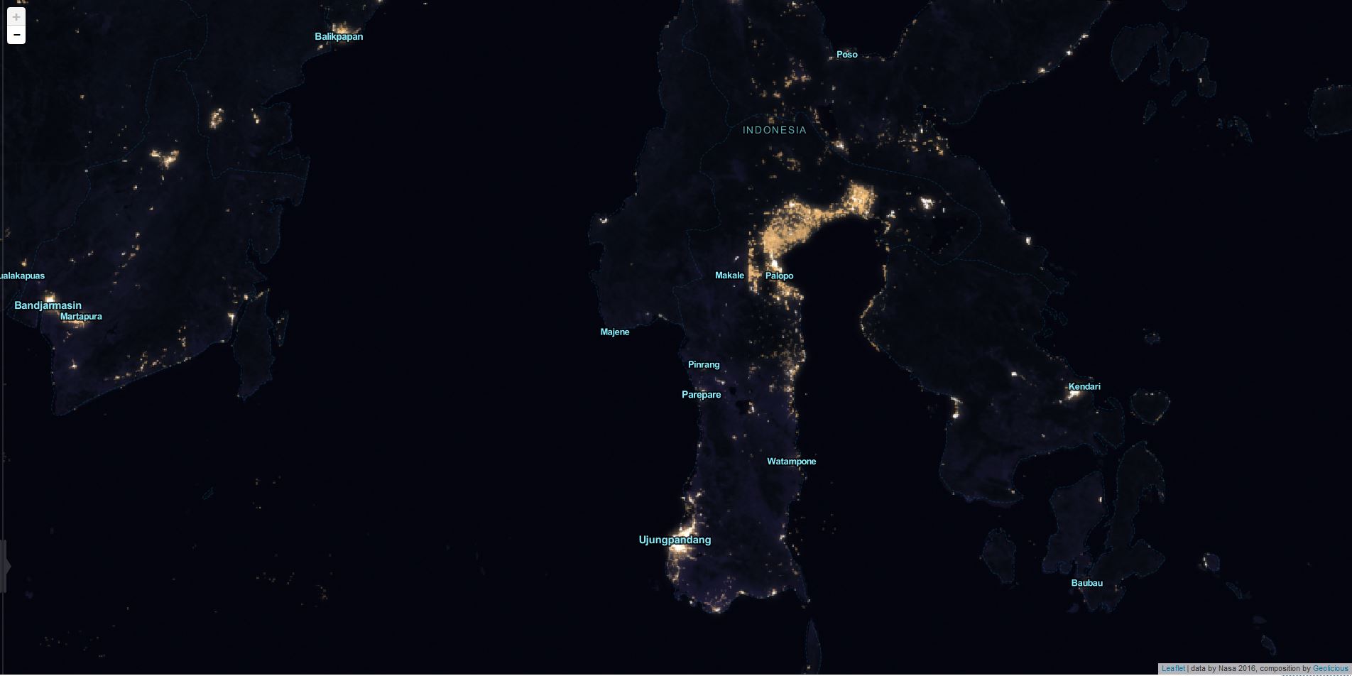

the Indonesian lights could well be forest fires from multiple days composited in one image. this has been observed also during the last black marble update in 2012.
see: http://www.abc.net.au/news/2012-12-20/interactive-nasa-sheds-light-on-mystery-wa-lights/4437664
this makes sense, sure!
What’s going on in Northern Norway? Seems the lights are going out! Maybe persistent cloud?