The Data
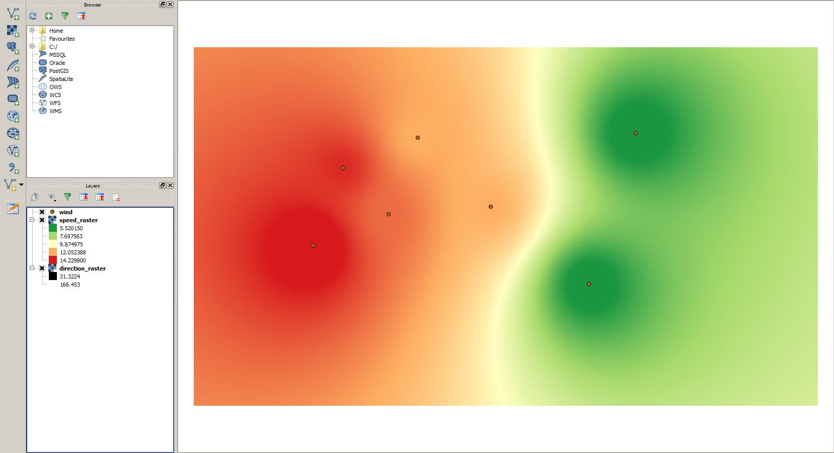
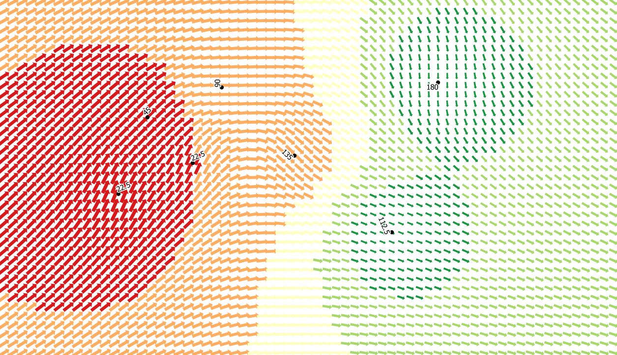
The whole process starts with the values for seven point location which could be potential weather stations or simple observation points. We have values for direction and speed of the wind for a single event. If you only have horizontal and vertical speeds (which seem to be a common thing for wind data) you can convert it to speed and directions using this source.
| Station | UTMX | UTMY | Direction | Speed |
| A | 615380 | 9531496 | 22.5 | 15 |
| B | 616004 | 9533157 | 45 | 14 |
| C | 617620 | 9533808 | 90 | 12 |
| D | 619191 | 9532326 | 135 | 12 |
| E | 621295 | 9530663 | 112.5 | 5 |
| F | 622303 | 9533906 | 180 | 5 |
| G | 616992 | 9532169 | 22.5 | 13 |
You can simply convert it into a shapefile by adding it as a csv layer and save it as a ESRI shapefile (download it here). After this comes the more less hardest task of interpolation of values for the vector field. As we are concentrated on the visuals instead the math behind interpolation I simply used the interpolation plugin. Ujaval has a nice tutorial on the usage of this plugin. I ended up with using a standard IDW (Inverse Distance Weighted) interpolation for both the speed and directional values. Of course this is over simplified and you can get your hands dirty with this. If you want to make it right you might read these articles:
-
Luo, W., Taylor, M. C. and Parker, S. R. (2008), A comparison of spatial interpolation methods to estimate continuous wind speed surfaces using irregularly distributed data from England and Wales. Int. J. Climatol., 28: 947–959. doi: 10.1002/joc.1583 | PDF
- Gumiaux, C., Gapais, D., & Brun, J. P. (2003). Geostatistics applied to best-fit interpolation of orientation data. Tectonophysics, 376(3), 241-259. | PDF
The Visualisation
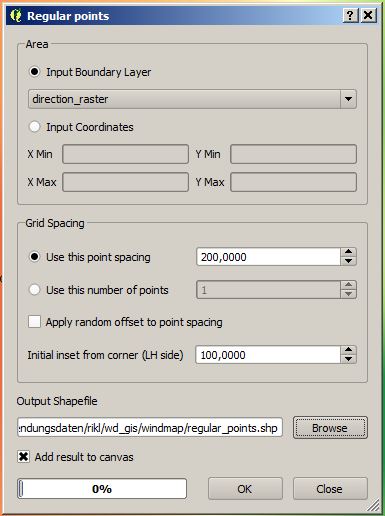
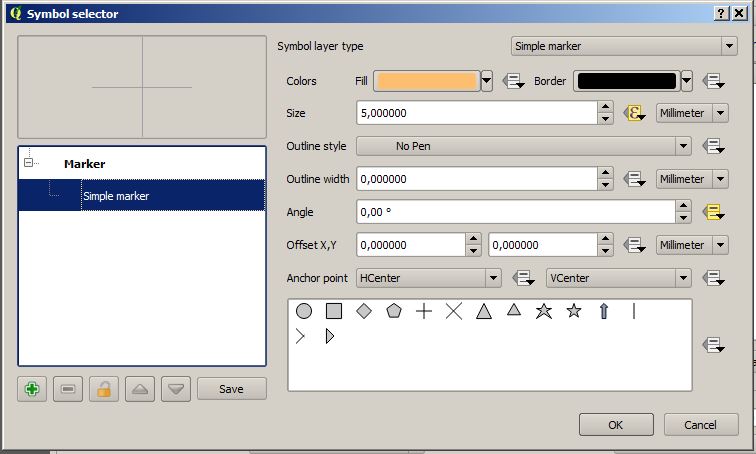
Now let’s open the properties and adjust the style of the regular spaced points layer to create a stunning wind speed and direction layer. First we choose a graduated style and change the base symbol to be the arrow: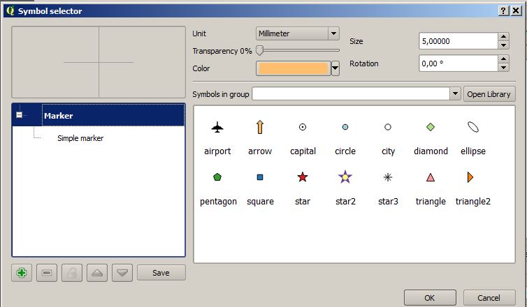
The result can look like this:
Nice. Styles and cartographic design are something I want to start to learn. Thanks.
Extremelly nice !!!. Do you have some geological applications ?? What about earthquake focal mechanisms-beachballs ??. Congratulations !
we had a tutorial on visualising dip and strike in QGIS in German but you can find something similar here: http://gmcgeology.blogspot.de/2014/05/creating-geologic-maps-in-qgis-strike.html
Muchas gracias Riccardo !!!
a reddit user mentioned:
Too bad all the arrows are backwards. Wind direction is reported as where it’s flowing from, not to. Otherwise a neat trick.
if you want to address this issue simply use a formula and adjust the rotation value in the field “direction”
…very nice tutorial – thanks a lot! I’m just rying to figure out how to build a suiting map legend for the direction/intensity-arrows, for as soon as i configure the visualisation value-based, I get only blank symbol-spaces. Any ideas how to show the arrows in the map legend by intensity-categories?
The direction-issue is simply fixed by adding a “+ 180” to the visualisation-setting (direction + 180).
How can I imply that I am working with degree data? If I have 359 degrees and 1 degree values eventually ends up somewhere at 180 degrees instead of 0 degress.
HII
i am doing a project on suitable site selection for Airport can anyone suggest any plugin in QGIS to uild the the Airport Simulation
With a few tweaks This technique could be a great way to generate detailed RASTER inputs for the Wind Effect tool .. nice!