I looked for a program to draw circles of a pre-defined radius around some points on earth I had the coordinates from. A quick search returned the website GPS Visualizer, and I absolutely love it! It is not only a great free website to convert GPS data in formats that can be used in GoogleMaps, GoogleEarth, jpgs and many other formats, it also allows you to customize maps very easily. Plus, you can use a large number of different maps as base data layer. It looks like the site has been created to deal with tracks and waypoint data, but the other features are not less interesting!For example, I wanted to do some kind of triangulation like for seismogram data: You have the distances from the source for at least three seismometer stations and you want to draw three circles around them. Where they meet there is the epicentre. Well, I have to admit I had more stations but less precise distance information. The tutorial of the website told me which syntax to use to produce my own customized map, and this is what I copied into the data field:
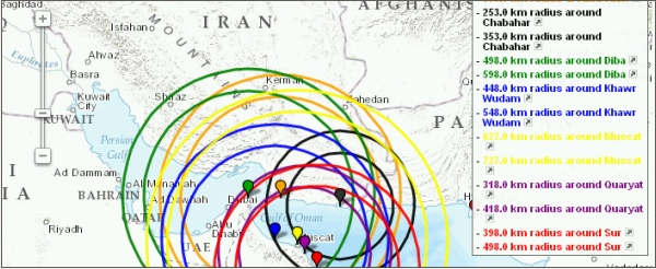
name,desc,color,latitude,longitude,circle_radius
Karachi, Pakistan,red,24.8117,66.9750,0
Jask, Iran,orange,25.6300,57.7700,"523"
Chabahar, Iran,black,25.2958,60.6030,"303"
Diba, Oman,green,25.6490,56.2690,"548"
Khawr Wudam, Oman,blue,23.8200,57.5200,"498"
Muscat, Oman,yellow,23.6333,58.5667,"677"
Quaryat, Oman,purple,23.2600,58.9250,"368"
Sur, Oman,red,22.5700,59.5200,"448"
Masirah, Oman,black,20.6833,58.8667,0
First comes the name, then the description, the color options sets the color of the circle, then we have the coordinates and finally the circle radius.
The output was the following map:
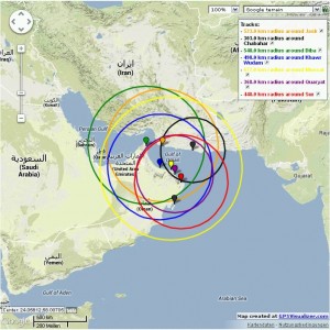
As it turned out, the circles do not meet at one point, so I added +/- 50 km of error and let the program draw two circles for each station:
name,desc,color,latitude,longitude,circle_radius
Karachi, Pakistan,red,24.8117,66.9750,0
Jask, Iran,orange,25.6300,57.7700,"473,573"
Chabahar, Iran,black,25.2958,60.6030,"253,353"
Diba, Oman,green,25.6490,56.2690,"498,598"
Khawr Wudam, Oman,blue,23.8200,57.5200,"448,548"
Muscat, Oman,yellow,23.6333,58.5667,"627,727"
Quaryat, Oman,purple,23.2600,58.9250,"318,418"
Sur, Oman,red,22.5700,59.5200,"398,498"
Masirah, Oman,black,20.6833,58.8667,0
Result:
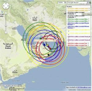
And here’s the last one with +/- 100 km error:
Great is that you have so many options for the visualization and that you can easily change the setting when you prepare your data in an Excel sheet.
You can also easily create a GoogleMap of a hiking trip and add your own photos, descriptions, symbols and much more. Check the website and have fun!
Be careful with circles 😉
http://gizmodo.com/5302604/just-where-can-north-koreas-missiles-hit
Good note! One reason why I love this website is that it automatically cares about such issues, see here: http://www.gpsvisualizer.com/examples/range_rings_map2.jpg. They note: “Also note that the circles don’t LOOK like circles because we’re looking at a round earth on a flat map… but the positions are correct with respect to the background.”
Hi! I came across this post this evening while looking for a way to plot great circles in Google Earth. Thanks! It works great. I have used the GPS Visualizer tool before. Looking forward to exploring!