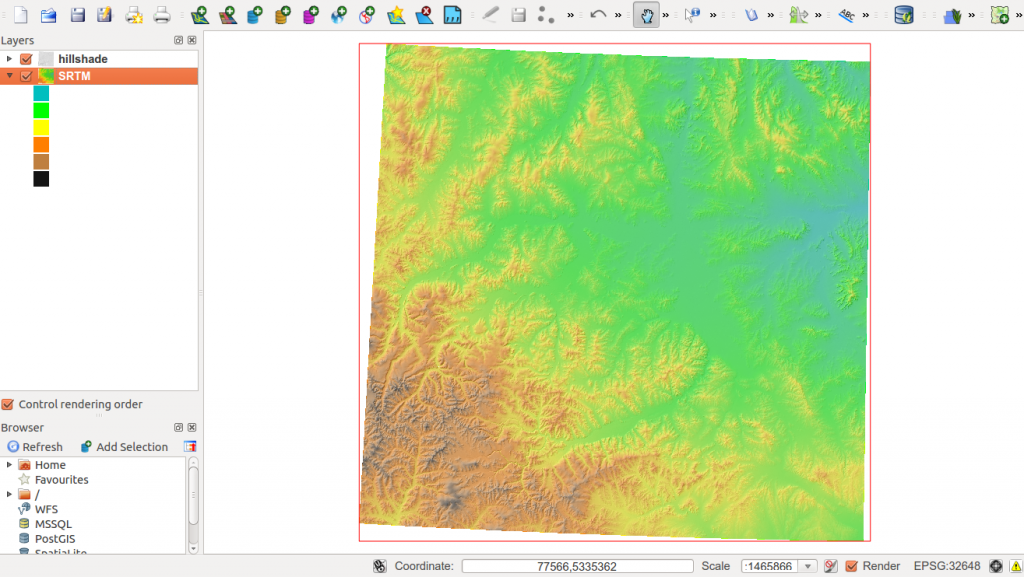
In our last session we started with some topographic “pre”-map as we prepared everything to create a printable map with QGIS which shows heights in a special area. As the map creation itself is somehow very detailed I’ll show you just basic steps so can go into detail with typo and positioning for yourself.
In our last tutorial we finished the qgis project to reach a state where it is plausible to create a map from:
<
p align=”justify”>
As the creation process is simple but needs a lot of clicks and adjustment I’ll show you the basic tasks in a set of videos.
In the first one: let us have a little walk through the good old map composer and see how to add your mapping elements and create a title:
In the next steps we will add a legend, a scale bar and some text elements. Of course the map composer allows you to export the map. I would suggest to use pdf, but see for yourself:
In the end: the print composer is very buggy and doesn’t have so many tools. But I am sure, that there are some plugins for it as well and I am very excited about the new QGIS 2.0 print composer…