Vintage Design in QGIS 2.2
Hello again! Thanks for taking a look at this post on how to create a Vintage Themed Maps in QGIS 2.2. Now for this process I am using QGIS 2.2 on Ubuntu 14.04, I only mention this because I have never compared the Linux and Windows version to see if there are any difference between the two versions. Furthermore, I would like to state that I originally the idea for this post from this Blog last year, so please take the time to look at it. Also, if you haven’t looked at my original post about Designing Vintage Themed Map with ArcGIS please take a few minutes and look at it to read about how I created the paper texture for my map. So being relatively new to QGIS and not using it every day I actually spent most of my time learning how to properly symbolize the Libya data that I used in my ArcGIS post. However, the learning curve was shorten considerably by watching the QGIS training videos that MangoMap created (and you can find those video tuts here), but being an ArcGIS/Windows dependent GIS dude for so many years I soon remembered some small things that I neglected to do before starting this task.
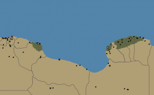
First, all my data was not in the same projection. ArcGIS re-projects the data on the fly for you and I just assumed that it was all in the same projection but I was wrong. Some of my layers only had geographic coordinate assigned to them (WGS 84 EPSG: 4326) and the rest of my layers were in Web Mercator Auxiliary Sphere. So I did a quick Google search to find out what the CRS was for Web Merc (which is EPSG: 3857) and BAM! I told QGIS what layers had the Web Merc projection and I was in business and all my layers were behaving correctly. Second, I never really worried what fonts are installed with Ubuntu, so I quickly found out that the ones that I used in my ArcGIS project are Windows default fonts (Segoe Print and Segoe Script) and Ubuntu doesn’t install them. However, this was solved by navigating to my HDD partition of Windows and finding the fonts that I used and installing them on my Ubuntu OS (thank God for the ability to Duel Boot). After finally getting all my ducks in a row with the projections and fonts, I was finally able to start symbolizing my data in QGIS Desktop. This did take a little time to complete, only because I am pretty picky with the colors that I like to use (I am still trying to find a blue that I can live with for large bodies of water). SOOO, after many different versions in QGIS Desktop, I was able to get a final map that I was happy with into the QGIS Print Composer project.
Next I created a new Print Composer project within my QGIS Desktop project (this reminds me a lot like how the process was to create a map in ArcGIS 3.x, and I remember missing that process when ArcGIS 8 came out), and then started Labeling all the features with the same font set that I utilized in my ArcGIS project.
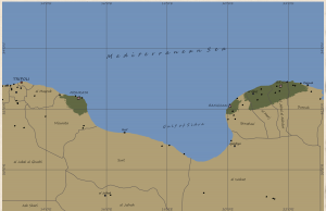
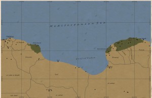
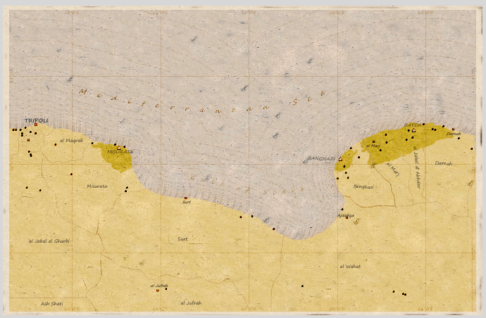
With everything labeled and my grid created, I started playing around the rendering options to give my map a vintage feel. Thus, I added my paper image and ordered it behind my Map element, and then I started tuning the rendering. I personally found that the “Multiply” Blending Mode with 0% Transparency created the most clear vintage themed map.
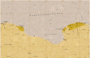
However, having spent some time in map libraries, I must confess that I really like how the map looked with the Blending Mode set to “Burn”. It really did create a nice looking aged/damaged map that reminds me of so many that I have seen at some really old libraries. When I look at this map below I can almost feel the dirt on my fingers. . Smell the mold in the stale air of an ancient library basement. And scanning maps all day with out a break with commander “Dewey” leading the collection operation! Ahhhh! Now that’s what I call fun!
Well I guess I digressed a little there. So in summary I really found it easy and navigate the labeling and overlays on the composition, but I must say that the labeling is not as advance as ArcGIS. I may be mistaken, however, I could not find a way to create curve text, I know I must sound spoiled, but I really do like that functionality within ArcGIS Layout labeling. With that stated that was the only issue what I really faced while creating these maps. I think that QGIS has a really good and basic set of tools for GIS professionals to utilize when creating their maps. It makes me really excited to see what new versions of QGIS will give us with newer releases. Ciao!

[…] to everyone who read my first post on this topic, Vintage Themed Maps in QGIS 2.2, and since I have receive positive feed back on this post I have decided to add more designing tips […]
[…] my blog I have done three posts of this subject so please take a look at them (ArcGIS Vintage, First QGIS Vintage, and Second QGIS Vintage). I have decided to stick with QGIS since it has more ability for you to […]