Yes it is Possible
Actually its not that difficult to design a vintage themed map. While I worked at the Library of Congress the person who held the position before my arrival leaned heavily on the vintage themed maps design, and to be honest they look really cool. So when I saw this
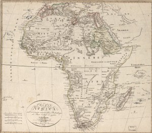
href=”http://anitagraser.com/2013/07/29/vintage-map-design-using-qgis/” target=”_blank”> blog post from Free and Open Source GIS Ramblings it gave me a spark to give it a try for myself. I have always wanted to learn how to create a really nice vintage map. I have tried several times, but always fell short to get an authentic vintage look but with ArcGIS only. I really liked the fact that Anita Graser (the author of the blog) used QGIS (I’m always happy when someone does some kick-ass map or spatial analysis without the help Esri). I have been wanting to learn more about making a nice cartographic product in this opensource program, but I really haven’t had to time to accomplish this task (its on my TODO list). And since I lack the basic skills to accomplish this in QGIS, I thought I would give it a try in my native GIS program, the evil, yet reliable, ArcGIS; ArcMap; ArcDesktop or whatever Esri and Jack are calling it these days (I missed a lot of the kool-aid meetings, i.e. Esri Conferences). So I decided to give myself a break from Leaflet and jQuery one evening and start designing a vintage themed map with ArcGIS. First, I would need a nice Vintage background paper image, and since I use to work at the Library of Congress, I have an abundance of very old scanned maps from various projects. I decided to use this little number from cartographer Johann Christoph Matthias Reinecke (1768-1818) (LC link here).
I really like the color of the paper, and I thought that it would make a good template for the background. So I used GIMP to remove almost all the ink with the Clone tool. I did leave some of the ink marking to give the background a flawed look. I don’t want my vintage map to look like it was printed on perfect paper. So this was my final vintage paper background.3
I was pretty happy with the final vintage paper that I was able to create. I feel that I was able to keep it from looking perfect, so with my final vintage paper background ready, I was ready to start working on my ArcGIS project.
Since, this was not a planned out project, I just decided to use some data that I had lying around, so I had some stuff from a Africa project that I worked on a few years ago so I thought that it would be good for this little project.
When styling this ArcGIS project, I tried to keep it simple. For the colors, I tried to use more earthy tones. For the fonts I utilized Segoe Print and Segoe Script to give it a more “hand-writing” feel. Now I included the Vintage paper I created to the ArcGIS project, and give my Libyan ADM1 boundaries a 55% transparency.
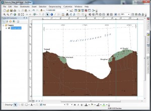
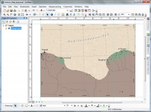
Now to say that I was a little disappoint would be a understatement. I found a major issue with being able to complete my task 100% in ArcGIS. Even though, I gave my ADM1 boundaries a 55% transparency, I still could not see my Vintage paper in the background. I understand that this not an issue with ArcGIS. Since I am in layout view and my data frame is on-top of an image that I inserted behind by data frame, there is no reason why I should see the Vintage paper. If I wanted this effect, I would have to load the Vintage paper as a layer in my data frame and then give it a pseudo-projection to show up behind all my other layers. However, that just sounds like a little to much work when I have Adobe Illustrator installed on my computer 🙂 So armed with a true publication application, I decided to finish what ArcMap cannot (I’m actually getting use to this workflow).
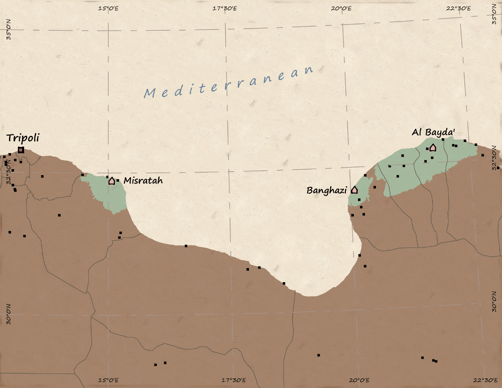
I am pretty happy with how the map came out, but its still needs some work to complete. However, I only spend about 2 1/2 hours on this from beginning to end, so I will have to revisit this and make it a little more Vintage. I think the edges need some work, and the darker colors need to be washed out more. In summary, once again I am reminded that ArcGIS is the leading desktop GIS tool, but when it comes to cartography it still has a long way to go. I enjoy using ArcGIS but I would like to have an all-in-one GIS/Cartographic solution. I can’t wait to try this in QGIS!
