Thanks to everyone who read my first post on this topic, Vintage Themed Maps in QGIS 2.2, and since I have receive positive feed back on this post I have decided to add more designing tips for vintage maps in QGIS 2.2.
At the end of my last post on this topic I stated that:
"[. . .] labeling is not as advance as ArcGIS. I may be mistaken,
however, I could not find a way to create curve text[. . .]"
I would like to say that I am wrong about this assessment, and with the guidance of Nathan Woodrow (Twitter and Blog) I discovered that you CAN create curved Labels (not Text like I was working with in my last post). Which I think is a much better method of labeling features in maps, and really I was just being lazy by using Text in the composer.
Anyway Mr. Woodrow suggested that I create a feature object (like a line shapefile) and then use the Labeling Tools to create the Curved Labels that I said was absent in QGIS. I followed his guidance and I must say I think it turned out to work better that just placing dumb Text on the Map in Composer.
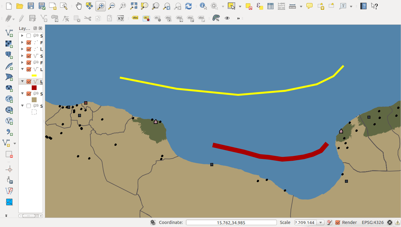
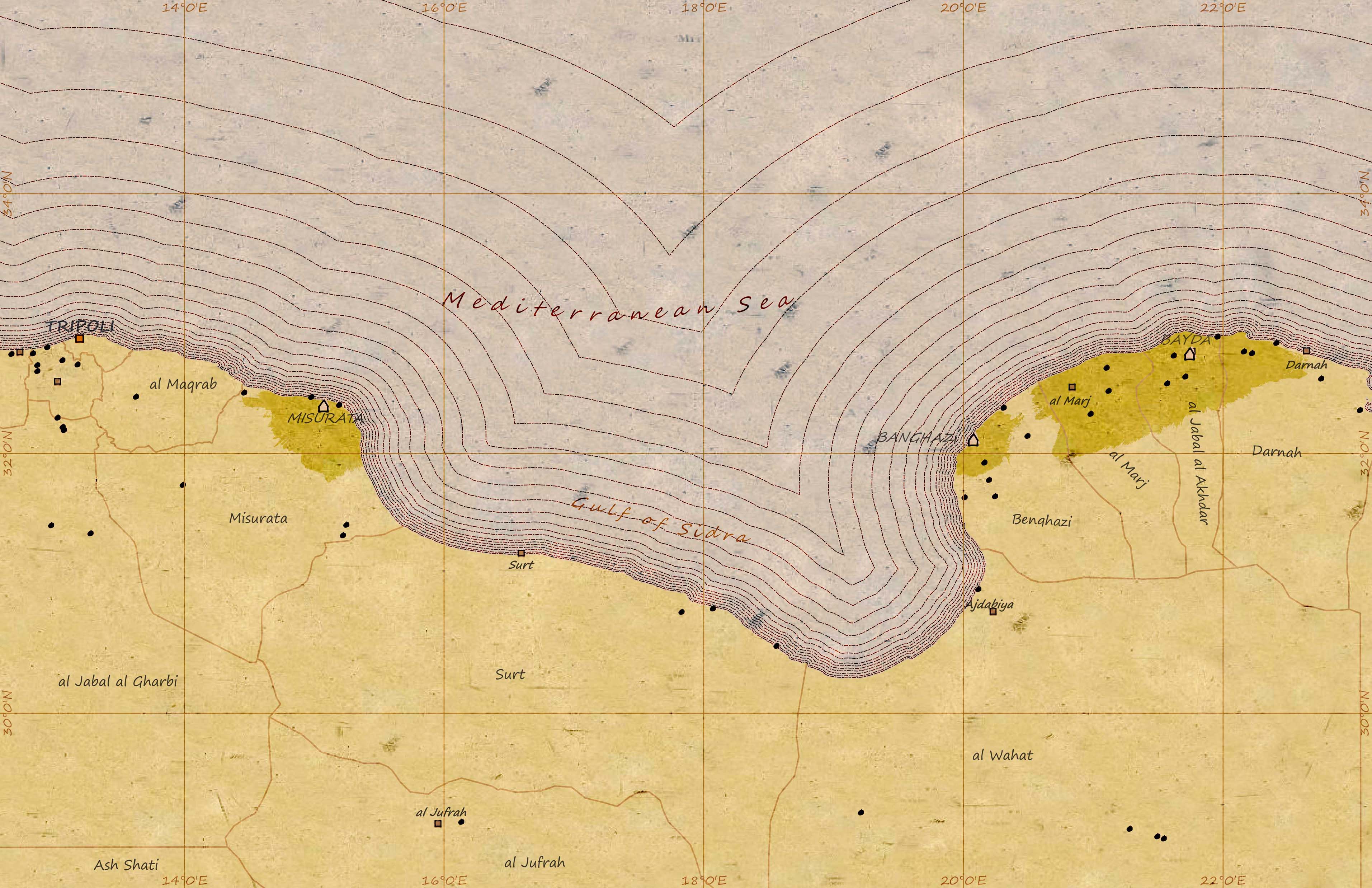
So here are the steps that I completed to get my curved Labels. First, I created a new shapefile called “Labels” with one attribute field to hold the label text, and then digitized the features that I wanted to label for my map. The yellow line is the Mediterranean Sea and the red line is the Gulf of Sidra. Second, I set up the labeling schema via the Properties > Labels tab. The option for “Curved” labels is under the Placement sub-tab. So I gave each Label a different shade of dark gray to help with the faded affect with the Burn rendering. And here is how it turned out:
I believe that the Labels turned out just fine, and I plan to do more labeling prior to creating the final cartographic product. Feeling like I accomplished something by adding curved text to my map, I decided to add another feature to my vintage map, Vignettes.
Creating Coastal Vignettes
There are many different methods documented on how to perform create Vignettes (buffer or Euclidean distance tools) in ArcGIS, and luckily these methods are easily transferrable to QGIS. My favorite method for creating vignettes for maps is the Buffer method since I am really aiming for a vintage look.
First, I needed to create multiple buffers are varriering distances from the coast line. Since my final map is ~1:1,750,000, I decided to start my first buffer at 500 meters and then I like to keep at an equal interval and then slowly increase the interval until I reached the distance of 527,250 meters from the shore. A lot of times its trail and error coming up with these Vignettes, and it may help if you calculate them out first and not just guess at them (believe me I’ve tried the guessing method and it doesn’t work).
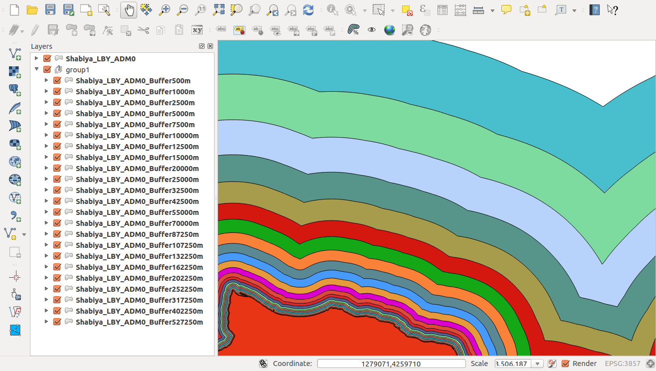
Now that I had to create all the buffers in separate file I merged them into one shapefile when I was happy with the sequence of lines, and then I loaded them into the Libya project that I have been building. I have learned in the past that vignettes look best when the lines are a Dash or Dash-Dot-Dash line style.
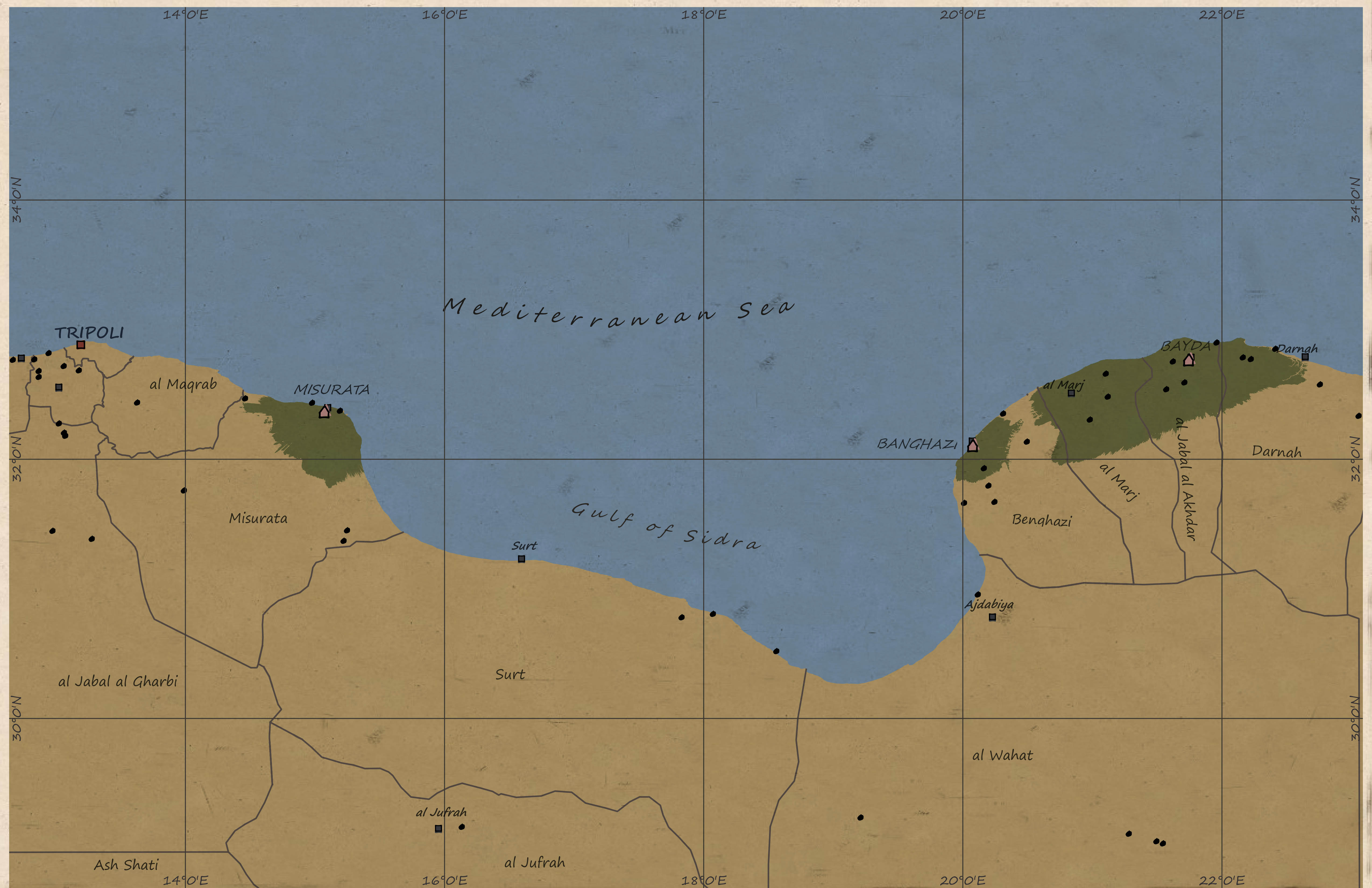
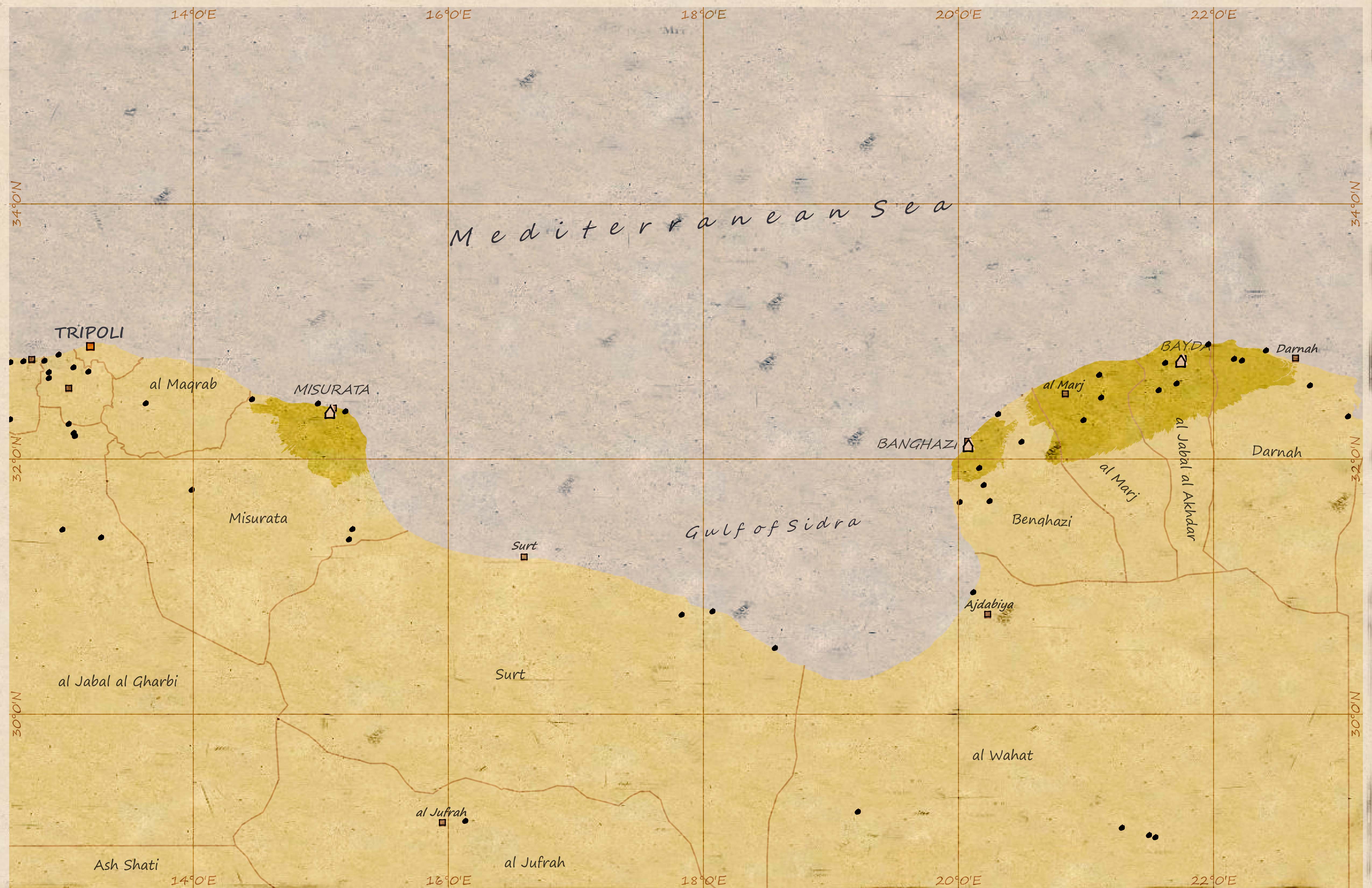
After finishing up the styling of the base map, I updated my composer layout with the newly added vignette layer to the Burn rendering version. I think that its adds a nice touch to the map and I think that the map is starting to have a nice vintage look.
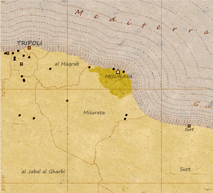
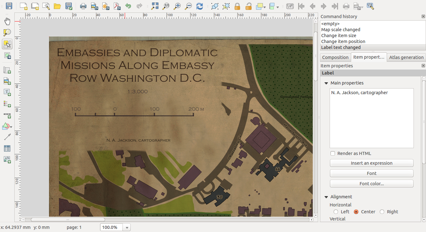
Now I only included at snap shot of the map because I am still trying to get use to exporting maps in QGIS. When I look at my layout in Composer I see this. . .
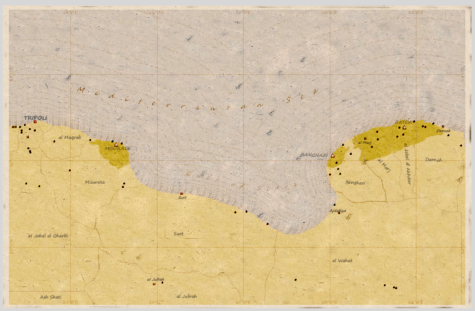
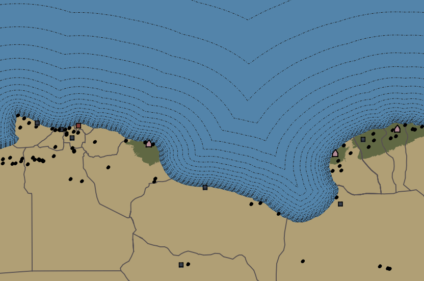
Now if you notice that the labels are looking really good. Nicely spaced out in a uniform pattern and they fully cover the ground real estate that I want them to, but when I export it as a PNG I get the following:
In this exported version of the map, you can see that the Labels that I created do not match the spacing and ground coverage of the layout in Composer. This is not a very big issue for me, I think I know how to fix it, but I just thought it was worth pointing out. Also, I think that I need to create a higher resolution Paper Image for my background, it really looks grainy when you zoom 1:1.
Thanks for reading this post and I hope its useful. Cheers!
[…] one of my first post on Vintage Cartography in QGIS (post here) I noticed that my labels were not being properly drawn when I exported my map to a *.png. But I am […]
[…] one of my first post on Vintage Cartography in QGIS (post here) I noticed that my labels were not being properly drawn when I exported my map to a *.png. But I am […]
Interesting comments , I loved the specifics ! Does someone know where
my company could possibly get ahold of a blank Autoartbotyshop
Authorization to Repair document to use ?