Thank’s to Andrej who wrote this comment:
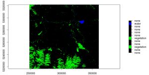
“Is it possible to to color the resulting 12 clusters within your original image to get a feel for visual separation?”
You can do so:

arg <- list(at=seq(1,12,1), labels=c("none","none","vegetation","none","none","vegetation","none","none","none","none","water","none")) #these are the class names color=c("black","black","green","black","black","green","black","black","black","black","blue","black") #and color representation plot(G, col=color, axis.arg=arg) [/sourcecode] But how to get values at a location? You will need these values to determine whether the defined class is representing a water body or a forest. Use the layerstack in a second plot as reference. But use this line to determine the class number at a chosen location: [sourcecode language="R"] extract(G, data.frame(locator())) [/sourcecode]
