Well, I think this will be my last post on this topic for a while. I feel like I could never stop on this subject because the more I work on designing a vintage style map, I find more ways to add another styling element. So if this is the first time you are reading my blog I have done three posts of this subject so please take a look at them (ArcGIS Vintage, First QGIS Vintage, and Second QGIS Vintage). I have decided to stick with QGIS since it has more ability for you to manipulate your map inside of the map composer, and truthfully ArcGIS just doesn’t have a lot of these functions to produce a final product without having to finish it in Adobe Illustrator or Inkscape. So without further rambling here is a quick “how to” apply final edits on a vintage themed map in QGIS.
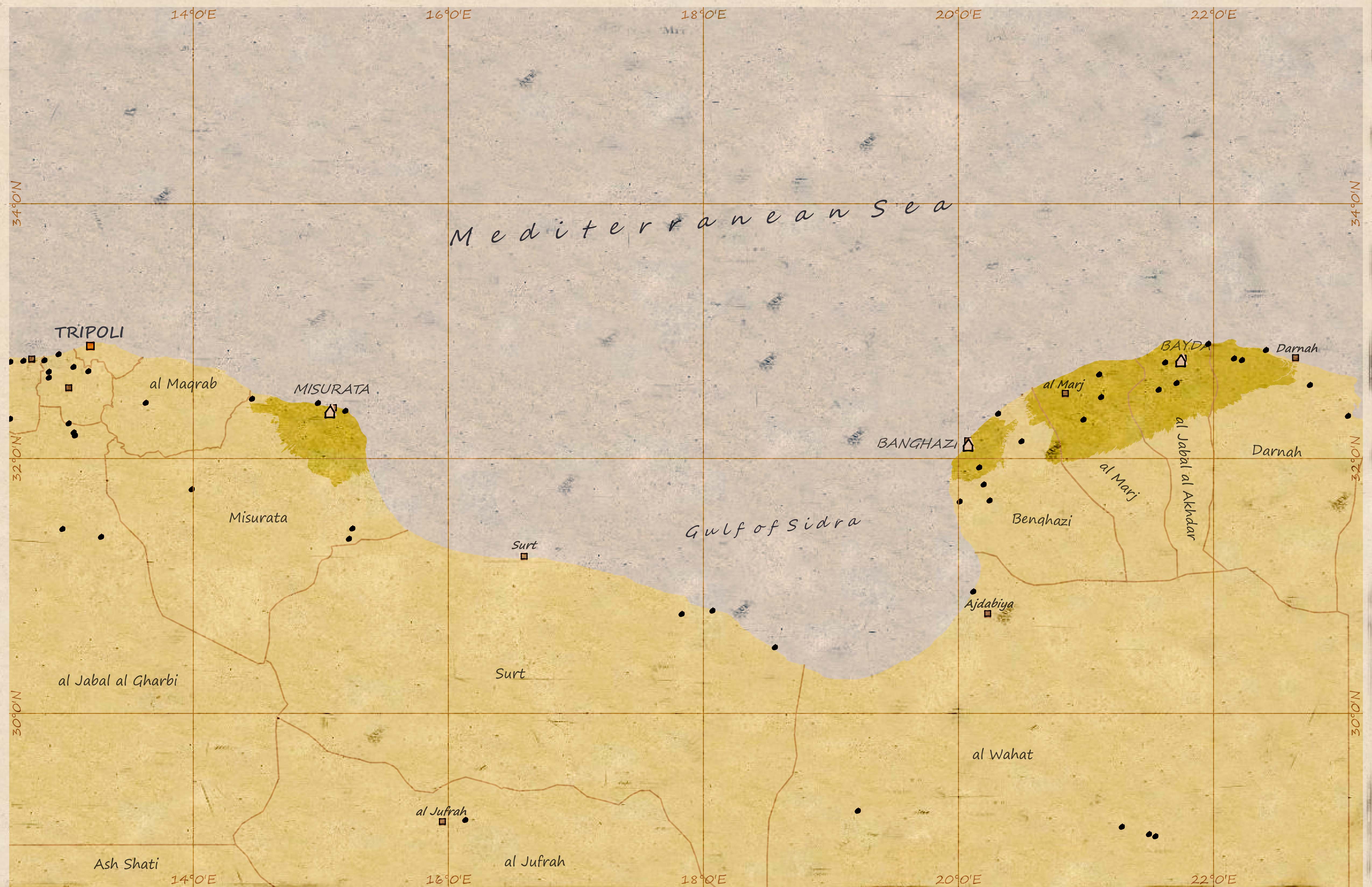
After completing my last blog post, I decided to change my geographic scope. Before I was looking at the northern region of Libya, and I started getting really tired of looking at this dummy data that I threw together. It was very limiting on what I could do with it and I really didn’t have it in me to create some pseudo-interesting to put on the map, so I thought I would create a map at a more local level. I actually was inspired by Alexandre Neto’s blog post, Mapa antigo no QGIS, and I really liked how he was able to generate such an authentic look and feel with very high-resolution data. Thus, I crossed the river via the internet and grabbed from data for Washington D.C. (link here) and started playing around with it. I really love how rich and detail local GIS data is, and I often forget this since I work at a more macro level. However, before I begin the finishing process of my DC Map, I needed to create a new antique paper background image. The last one that I was using was lacking in resolution that I needed to create a large map. However, unlike last time, I made a conscience effort to find a map that had match the following characteristics, must have large dimensions, color must be a neutral tan or beige, edges must me worn and some tares, and there must be some hand writing artifacts on it. So after some searching I finally found my map, and I began the LONG process of removing the content of the map and still retain the paper texture (I will not bore you with this long process).
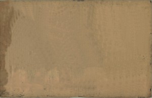
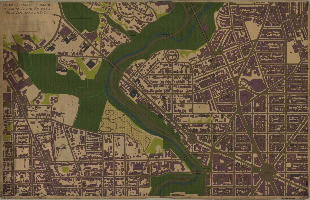
With a lot of trial and error I was FINALLY happy with the above antique background image. With this process completed I can actually start making my map. I decided to create a map highlighting all the Embassies along DC’s famous Embassy Row¹.
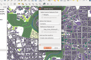
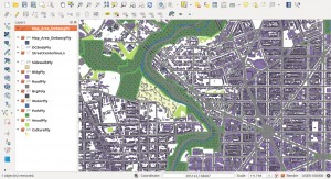
Styling the ancillary data (roads, parks, water, etc.) was real simple, but I really need to make the Embassies pop off the map. So I decided to take the Embassy location point features and use the Spatial Query tool to select all the Buildings that intersect with the points and create a new shapefile from the result.
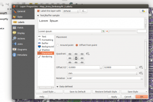
With a new Embassy Building shapefile, I would just use the Embassy point shapefile as a label anchor. However, I soon discovered formal names of embassies can be really long, for example “Embassy of the United Kingdom of Great Britain and Northern Ireland”, and they really make it hard on positioning the labels (seriously that title is 67 characters long!). To work around this issue I gave each Embassy a new unique number in their attribute table, starting at 1, and then labeled the point with the new ID number. I also removed all styling from the point since I now have a building footprint to represent the Embassy location, and I set the label placement on-top of the point location.
I decided to use a different font set for the labeling on the Embassies, so I used Purisa it still holds a nice print/script feel to it but it’s not overboard with the “hand written” style. With my main feature data labeled, I applied labeling to parks, roads, and the one cemetery to finish up my map.
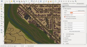
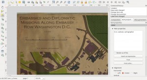
Content with the styling of my map I could start working on the final output in composer. I decided to make my final map at ANSI D size (22×34 inches is smaller than my background image so I adjusted the image size in GIMP), and loaded my background image first (Normal Blending & 0% Transparent) them my Map (Multiply Blending and 0% Transparent).
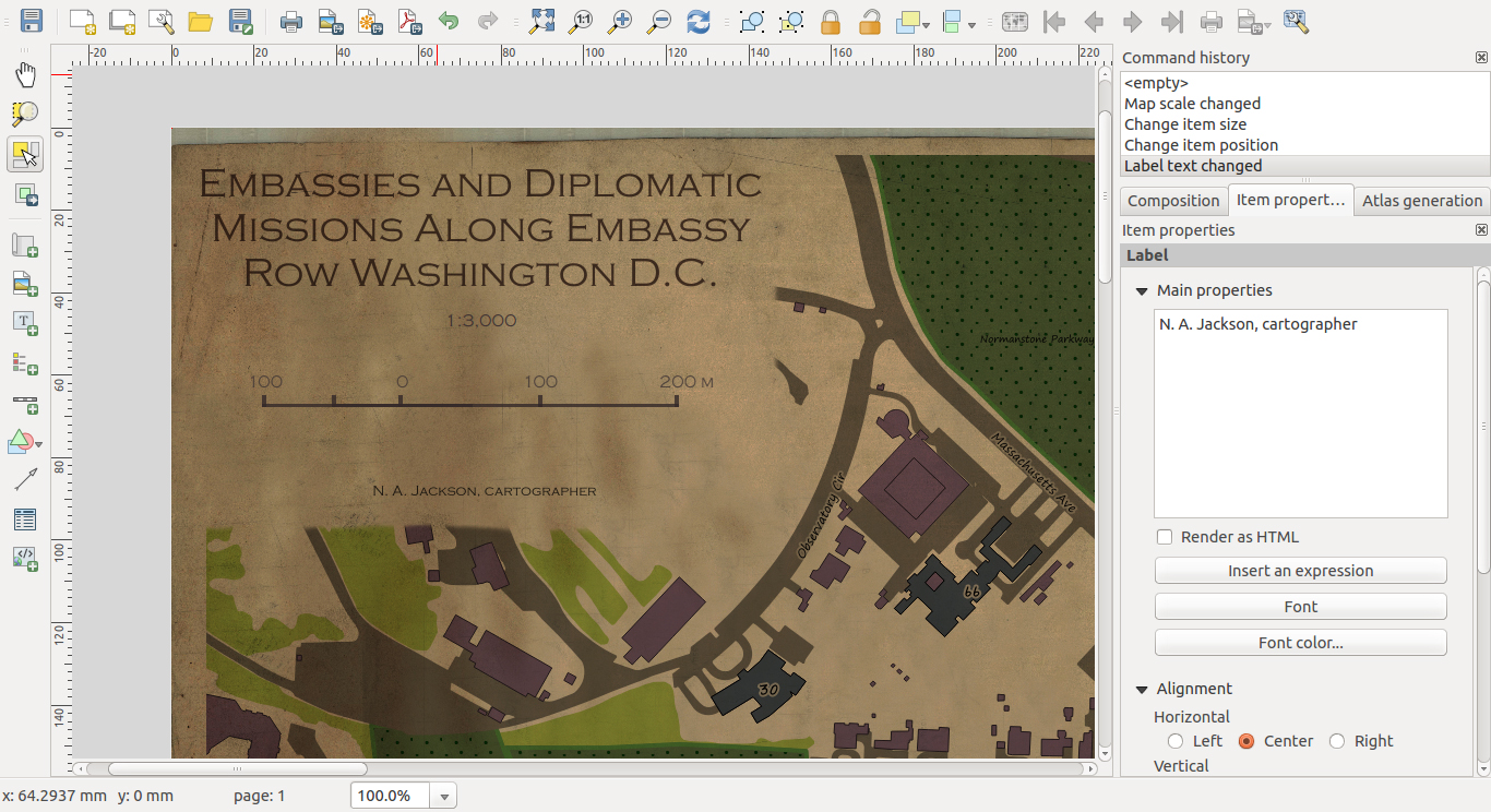
Now I was very pleased with how the map was looking however I wanted to create a “title box” to add some map elements like a scale, title, and/or a north arror. However, I was really having issues on how to add this feature to my map without it looking out of place and too modern. So I did a little brainstorming with myself, and after trying some bad ideas first and I came up with this solution:
- First decided where the title box will reside on our map and measure how large it will need to be
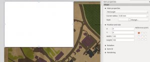
- Second take those measurements and crop the background image at the same location
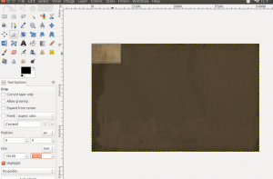
- Finally save this new cropped background image as .png (support transparent background) and lightly erase the “false” edges of your title “box”
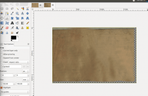
Then you just inset your new image “title box” in the same place that you measures before and you have a nice clean area to place more map elements.
I was very please with how this turned out. I had been struggling with a way to add a “box” to my vintage themed map, and I think I finally found a fairly simple method.
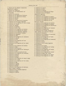
Oh and to put the finishing touches on my hard work, I created a new composition and added the listing of the Embassies with IDs to create my key. I used Traveling Typewriter for the font set.
In closing, I started out in this series on how to create vintage themed maps in a modern GIS with not know how much work it really takes to produce a final product. And I really didn’t think it would be possible to do a lot of the things that I have done. However, with the most recent releases of QGIS 2.x it has made it easier to accomplish. If I had to perform this mapping task with only ArcGIS as my GIS program, I would have to spend a LOT of time in Adobe Illustrator to get a reasonable final product. I’m excited to see what QGIS will do in the near future. I hope you find this and my other post helpful, I enjoy doing them but I plan to switch gears at start working on a different geospatial topic. Cheers!
¹ If you are not familiar with Embassy Row there is an nice Wikipedia page for you to enjoy.
Hi, is there a way to get this great background image in better resolution?