Statistical data for a geographer is fun! War is not!
Regardless what you think of the military it never hurts to be informed, so… Lets play a bit with military expenditure statistics.
I’m using data from SIPRI (Stockholm International Peace Research Institute), which covers military expenditure for regions and countries based on for instance GDP.

The data is in Excel format (.xlsx) which is a problem for QGIS, so it has to be converted to a format that QGIS understands. First however some other issues must be addressed.
In order to use the years as field names they must be changed so that they do not start with a number. I’ll simply add the letter “Y” in front of all years.
In the table there are also some fields that contain non-numerical values to represent “Data Unavailable”, which is bad from a GIS perspective. For it to work I replace all non-numerical values with “99” for unavailable data and “98” for countries that didn’t exist at the time. These numbers can be filtered out later in QGIS. I also remove the “Notes” column, which contain a lot of weird characters and links.
I chose to save the sheet as comma separated textfile (CSV). In my case the text file also needed some attention before it started to work. It worked better with decimal points than the standardized decimal comma and comma separated text worked better than tab separation. These changes was easy to do in a text editor, just don’t try to replace the tabs with comma first and comma with point later…
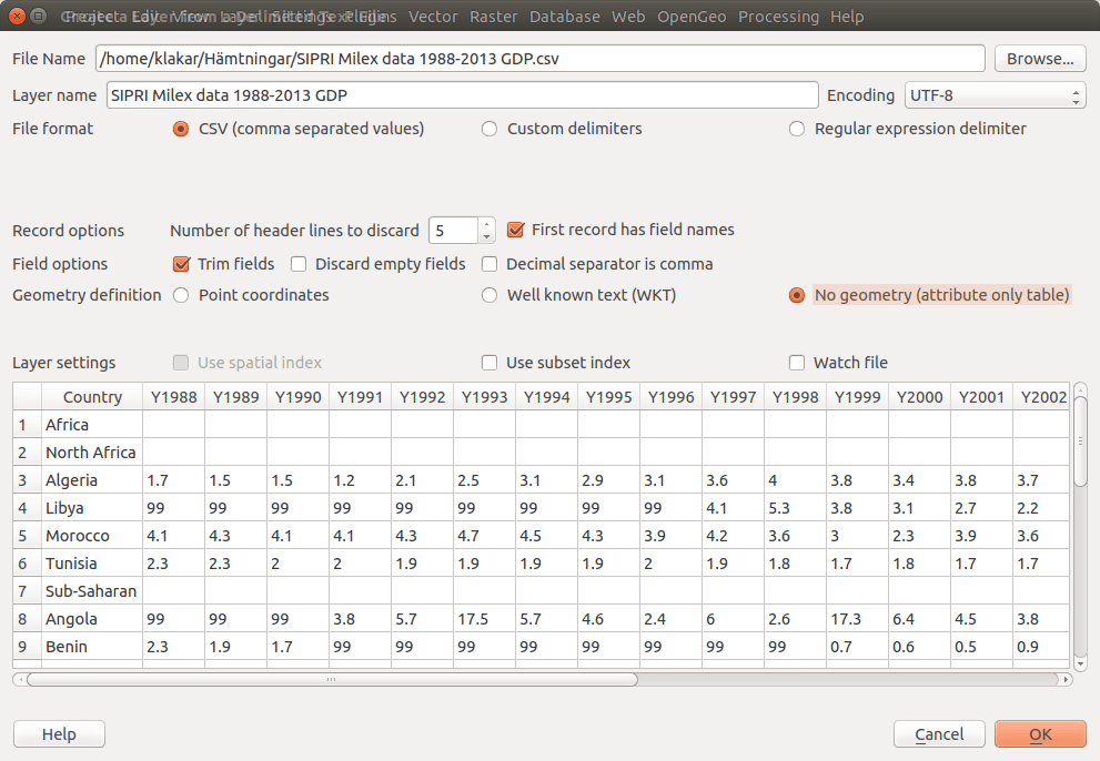
Using the “Add delimited text layer” button and selecting “comma separated values” without geometry (and some other settings to get the correct field names) it is possible to import the data into QGIS.
To display the data you also need some polygons. If you have current data use that, but if you don’t here’s a link to some free data (link).
License (CC BY-SA): The world data is in shape format and dated 2008. Border changes since then is obviously not included, and as stated on the site some borders are also disputed. Use the data with caution. Data provided by Bjorn Sandvik, thematicmapping.org.
Unfortunately not all polygons represent a country and not all countries are spelled the same way in the two files.
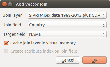
When you create the join (layer properties – Joins) you can use a simple style to visualize which countries are missing data and fix this in the text file by editing the country name so the same names are used in both files.
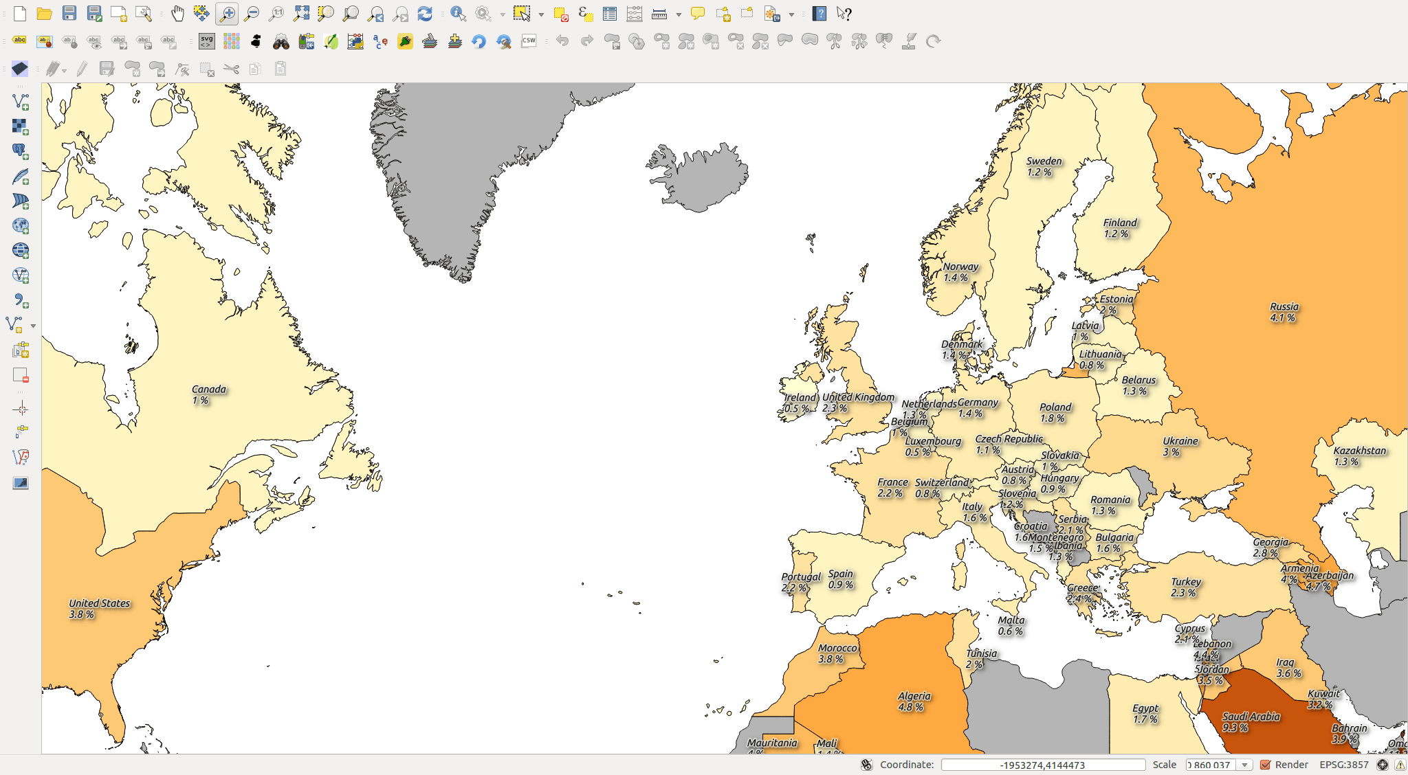
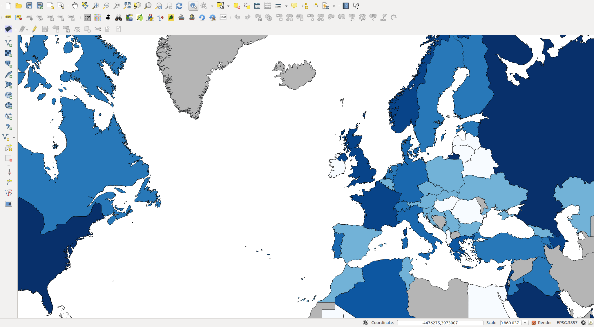
After a lot of problems with converting text to decimal numbers (probably a QGIS bug concerning decimal character settings), I got a map showing military expenditure as percentage of GDP (above).
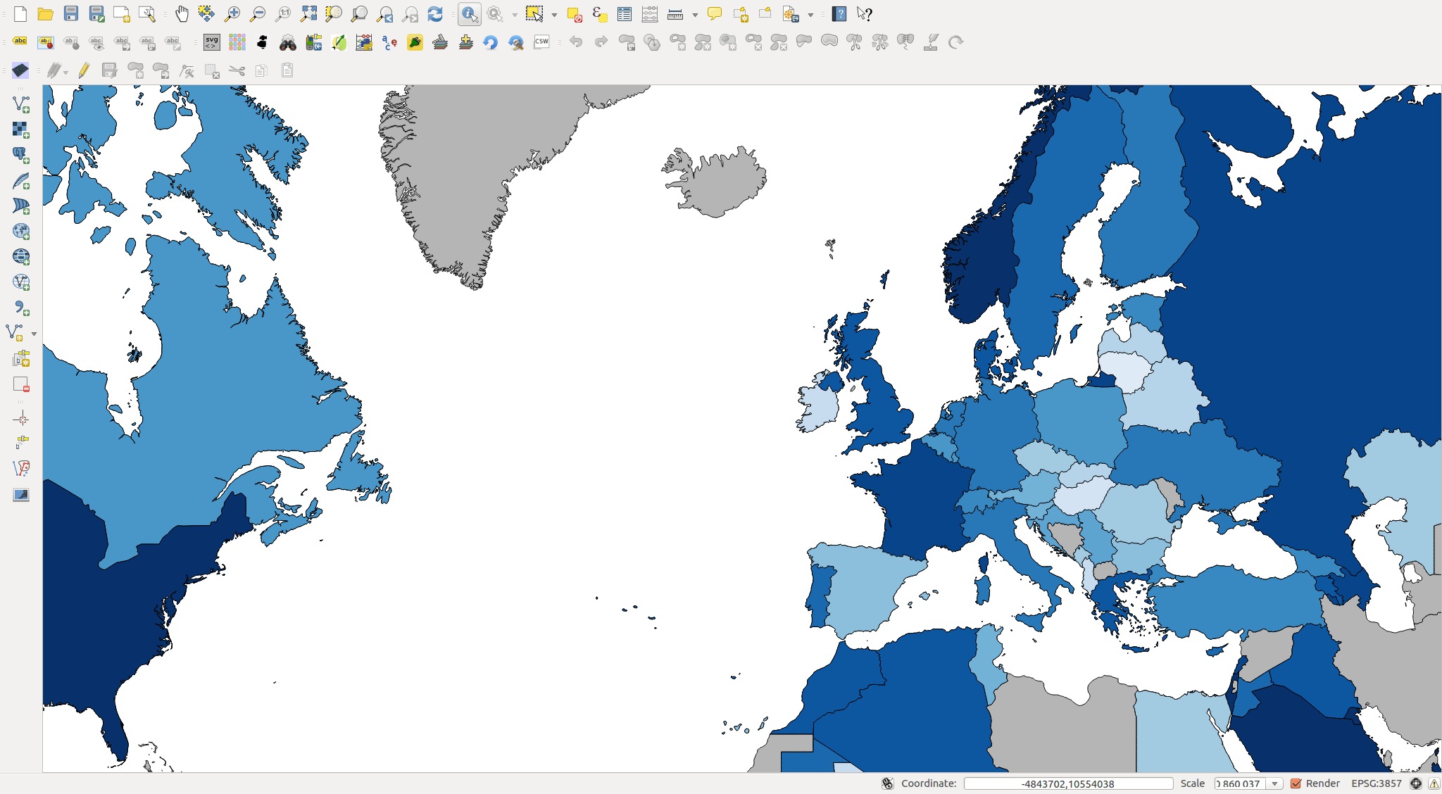
Using the same technique with expenditure per capita gave a different result (below).

So, now what? What if I create a “quota” from the two results that is based on a ranking (percent of highest value) and add those together?
The countries that spend more per capita as well as compared to GDP will get a higher quota…
The darker the colour, the higher the quota.
If someone object to “adding” the ranking here’s the same where the ranking is multiplied.
Multiplying is dragging the scale apart some more.
Well then, what good is all this then?
I don’t know… all I’m interested in is working with GIS and statistical data. Now it’s up to you to draw any conclusions based on the result, or create your own analysis with this or any other data you find interesting.
Some conclusions from a QGIS point of view:
- As with most software there’s a problem with the use of decimal character in QGIS. You can’t predict everything, but you should know what works and what doesn’t. Right now I’m not sure what is the right way to do this.
- If you want to make a “feature subset” using a query, you can not have table data joined to the feature. Remove the join first.
- Statistical data is fun, but dangerous! Be careful with what conclusions you make based on your analysis.


Nice article. Would you mind to share the map as export, say pdf or svg?
Try this: https://digital-geography.com%20.www378.your-server.de/diggeo/wp-content/uploads/2014/07/digital-geography_MilExpenditure2013.pdf
Mind the license though!
The conversion of the string to decimal columns can be easily done by creating an additional cstv file defining each column’s format before importing the CSV file to QGIS. Check this post: http://anitagraser.com/2011/03/07/how-to-specify-data-types-of-csv-columns-for-use-in-qgis/
[…] ett tag sedan skrev jag på digital-geography.com om militära utgifter för olika länder och hur man använder QGIS för att visualisera denna typ […]