Since QGIS 2.6 was released with a lot of new features and functions I’ve been testing it sporadic and have come to realise that the quality and functionality of symbol styling and labelling is so high that ESRI ArcMap no longer can match it. Honestly I haven’t tested the 10.3 version of ArcMap, so my experience is based on previous versions.
Here I’ll use an example to highlight some of the extensive possibilities offered in QGIS.
I’ll be using “live” earthquake data from USGS in GeoJSON format and if you want to know how this is done you can find an article on it in my blogg (in Swedish). Oh, by the way. I’ll also be using Open Street Map as a background for simplicity.
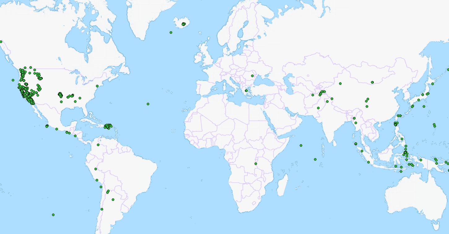
In the image above all registered earthquakes the past seven days are visible. You can get other time periods as well if you want to, but this suites me perfectly.
Earthquakes can be of different type and as the complete amateur I am on the subject, my assumptions may be incorrect, in which case I apologise. The attributes I’ve chosen to highlight are:
- Magnitude – the strength of the quake.
- How “significant” the quake is (attribute).
- Is there a risk for a Tsunami (attribute).
In the attribute table more attributes are available, but I’ll settle for these.
I’ll also use two attributes for labelling, magnitude as simple text and a prepared longer text attribute.
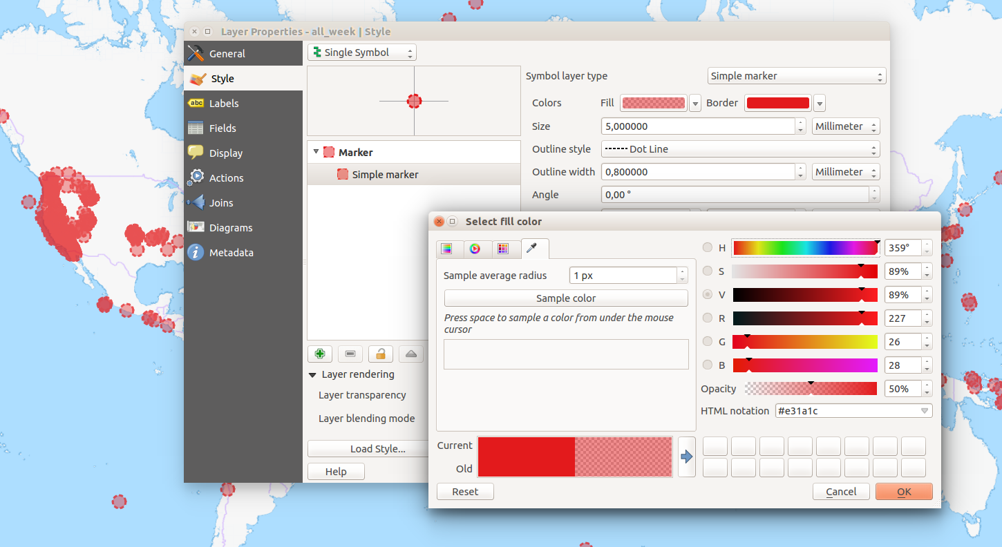
First of all I’ll create a base symbol. A simple marker with red fill and red outline…
Wait a minute! That doesn’t work, does it?
Yes, it does! With the new colour picker it’s easy to set transparency for each individual colour in a single symbol ( “sweet” ). Here I’ve chosen 50% transparency on the fill, and then an overall transparency of 25% (hidden behind the dialogue in the picture above). This gives me a nice symbol with a fill colour more transparent than the outline.
I won’t be using the single symbol styling, but it’s a quick way to test a concept. I do however want to use my symbol so in the dialogue I press “Save”, to save it to my symbol library.
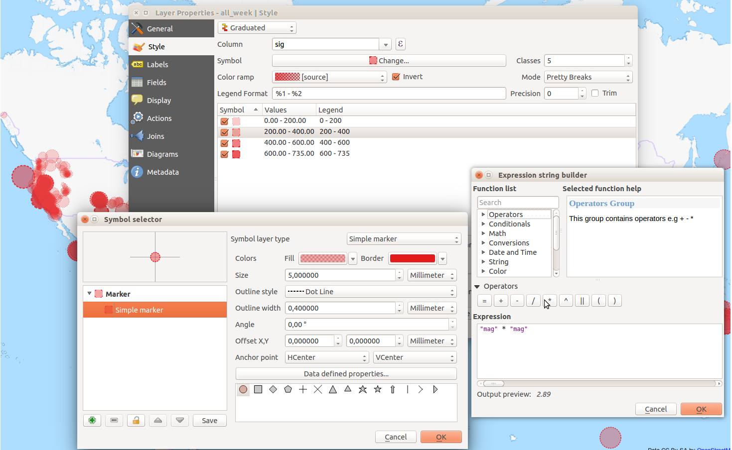
I’ll be using Graduated styling based on how significant the quakes are. I use my saved symbol as a starting point and a custom colour ramp that goes from red to red, from more to less transparency. Yes, you can have different transparency in a single colour ramp!
Using “Pretty Breaks the data is classified into four classes where less transparent features are more significant than the more transparent.
To amplify the effect I’ll also change the thickness of the symbol outline, so that less significant quakes gets a thinner outline.
I’m using the magnitude to control the size of the symbol by using an expression. Size field, or expression, is set under the button “Advanced” (hidden under the expression builder dialogue in the picture above). I chose to multiply the magnitude with it self to point out that the Richter scale is not linear, thus giving larger quakes more importance.
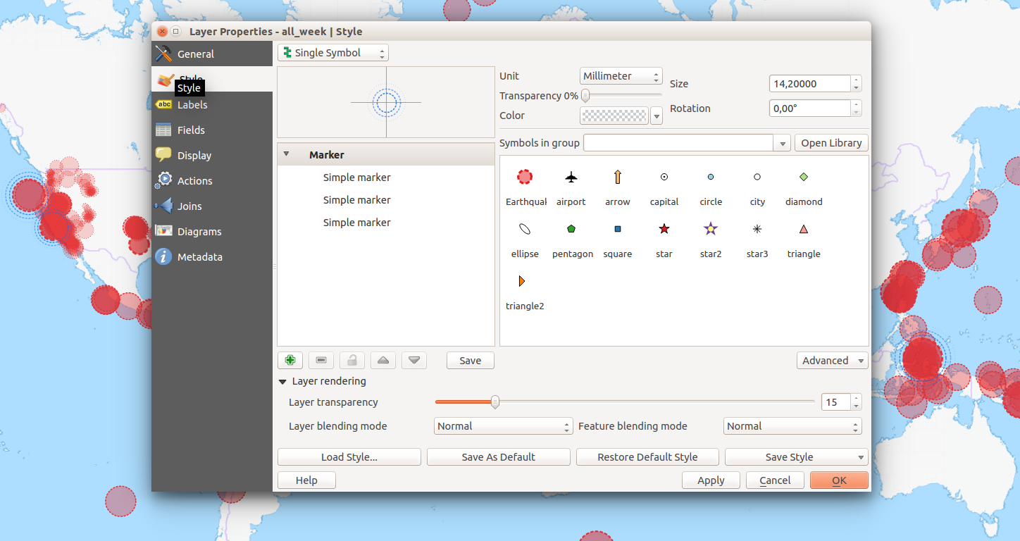
To symbolise Tsunami warnings it’s simplest to create a layer copy and change the styling of that layer. It is possible to create very complex rule-based styles, but if you do, you loose the possibility to set size to an attribute (I think).
First of all I’ll limit the features by a feature subset using the query builder in the general tab. Setting “tsunami” = ‘1’ will filter the uninteresting features out.
As a symbol I start with my saved symbol but change it to three large blue rings, gradually thinner and more transparent ( I love this! ). The size is dictated by the magnitude, the same way as before.
The result is pretty clear, even if there are a lot of overlapping symbols in the map right now.
Next, labels:
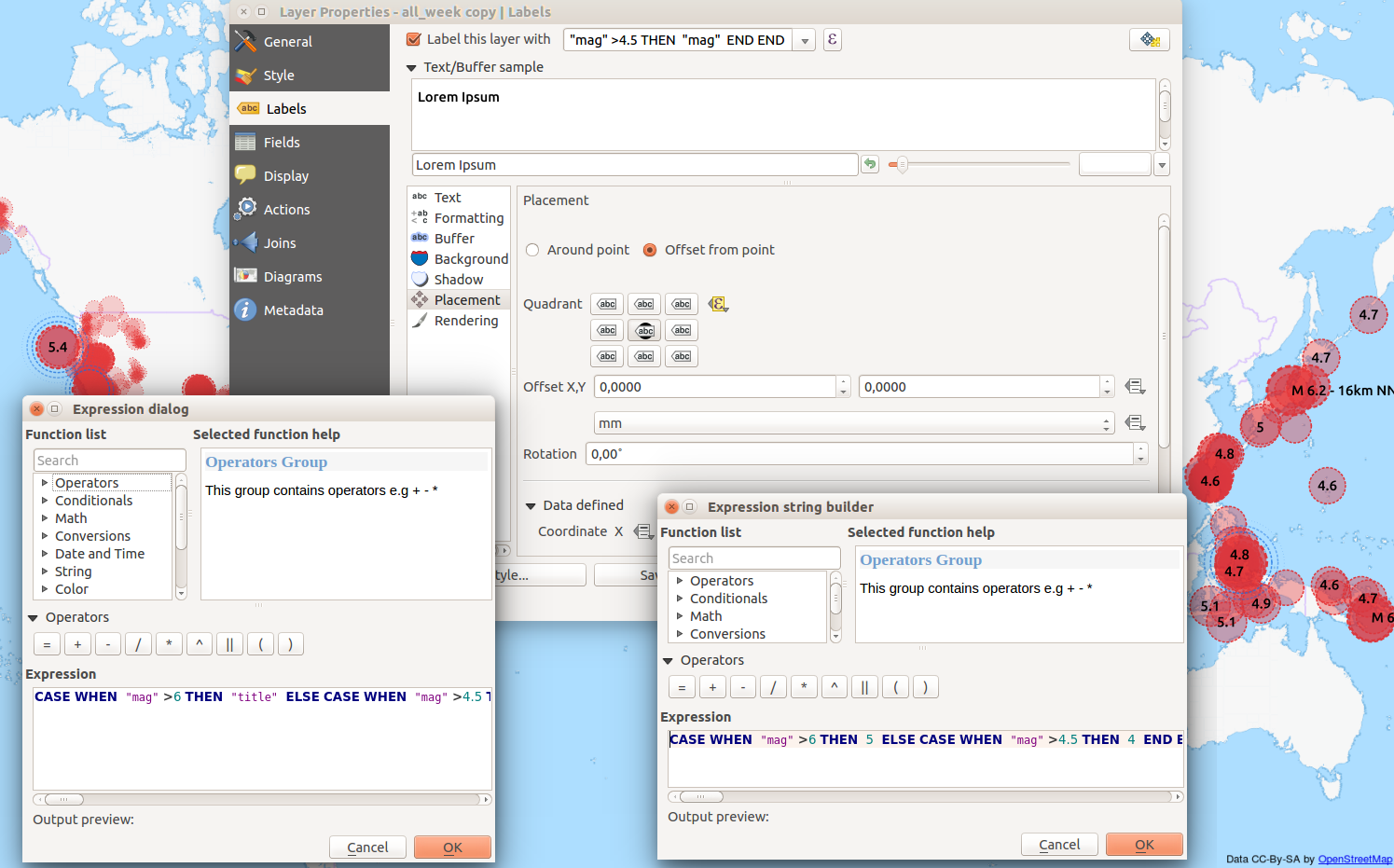
I want different labels for medium and large quakes, while the smaller ones will have no label. What is classified as a large or small quake can be debated, but here I’ll set the limits at 6 and 4.5.
The text for the labels will be collected from an expression (the dialogue bottom left in the image above), where the attribute “title” will be used if the magnitude is greater than 6, and if that isn’t the case the attribute “mag” will be used for quakes larger than 4.5.
Simple numbers I want printed on top of the points, but long texts should be printed out to the right. This is solved by a data defined override (yellow button in the centre of the image above) and an expression similar to the previous (dialogue bottom right in image above). Here the value “4” (center) or “5” (right) is assigned depending on magnitude. What values to use is shown when the mouse hovers over the button.
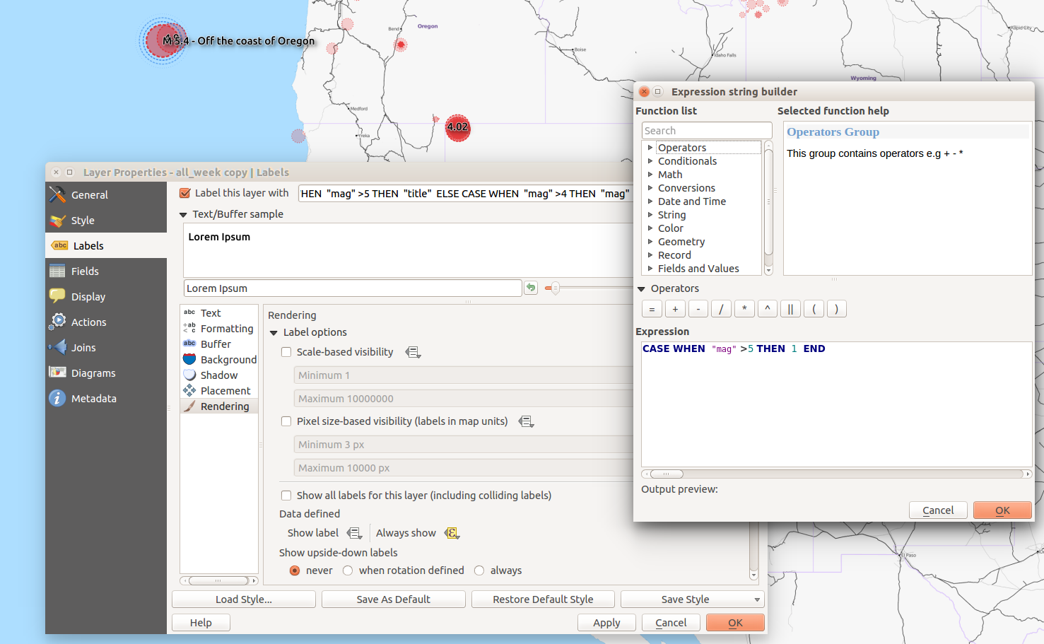
You can override the rendering rules and show all labels including those that overlap with a simple check box (image above). I don’t want this, but I do want to make sure the large quakes always are labelled. This is done by yet another data defined override which in this case forces the label to print, if the magnitude is greater than 5.

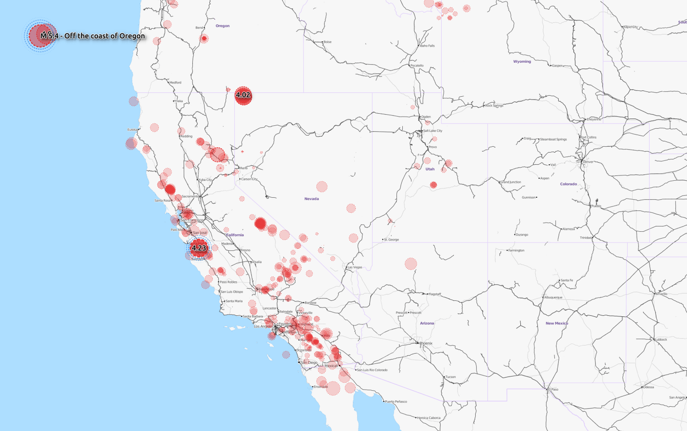
In the picture above I’ve tweaked the settings for buffer and shadow, as well as their separate transparencies. I also changed the values some in order to show all differences at the same time.
I’m really happy with the result that shows registered earthquakes the past seven days by magnitude (size), significance (transparency) and risk for tsunami (blue rings). Considering I’ve only just touched on the possibilities regarding styling in QGIS I’m pretty convinced QGIS, in this regard, is superior to ESRI ArcMap.
What do you think?
Great map design, Klas!
Yes, nice map design! Are you using the Ubuntu typeface?
Yep! Didn’t really think about it…
I think it actually looks good. 🙂