In some applications you want to calculate the density of points. It sounds very easy and in fact it is using QGIS. Let me show you how to create a point density raster. Especially, let me show you how to do this with the heatmap plugin in QGIS.
Prerequisities
You will need the common installation of QGIS 2.0.1 Dufour and an installed heatmap plugin (see how to install a plugin here). We will use some field data from Indonesia with 500.000 data points. You may download the data (12MB) we will use here.
The doing
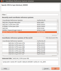
Fire up QGIS and set the CRS of the project according to the used CRS in your data. In our case it is WGS84 Zone 49S which is EPSG:32749 and use the Layer->Add Delimited Text Layer function to add the downloaded test data to your project:
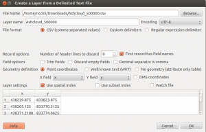
I’ve chosen to create a spatial index as it improves the handling of this more or less bigger dataset. After this you need to determine the CRS of the data itself:
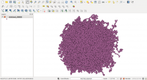
Now your project should look like this:
Creating a point density map is the purpose of the heatmap function/plugin. As you might have this installed prior you should follow Raster->Heatmap->Heatmap. We need to fill the parameters for the heatmap:
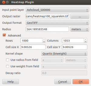
I’ve changed the standard parameters a little. The colums Output raster and Output format should be clear. Avoid some special ooutput formats and try to stick with standard GeoTIFF as it is recommended by the author Arun. Radius is the radius to search for points around a location in m or map units (in our case it’s meters as we are using a projected Coordinate Reference System (CRS) with a base unit of m). As we are using the Quartic (biweight) kernel it defines the direct distance to the point itself. I am using 564m as the radius so I can easily state that the values in the raster describe the density for a square kilometer. By using a different kernel this could change as the form of the kernel changes. The Quartic (biweight) seems like a circle kernel.
The rows and columns as well as the cell sizes determine the spatial resolution of the target raster. The finer the raster the longer it takes to compute the raster. Keep this in mind. There are also more parameters to adjust but you may want to press the help button to get some insight in the functionality of the plugin itself.
The results
The resulting map is an image going from black (means small number of points around) to white (large number of points around the given location). We will change this to be more informative. First open the properties of the raster go to the histogram tab and compute the histogram. You will see that the curves reaches till approx. 13 on the x-axis which means that the highest values are about 13 points per km²:
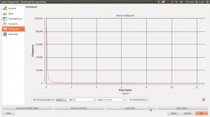
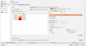
We will use this value in our Singleband pseudocolor representation. Therefore switch over to the Style tab and change the Render Type to Singleband pseudocolor. I am using the color ramp YlOrRd and set the Max value to 13. After this click on Classify and on Ok:
By using the identify results button you can now check the value at each location:
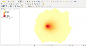
You may ask, why the values are not integer. According to the filter we have used, points near a certain location have bigger influence than points far away a given location. So the points are weighted in their influence. This is useful as we might have an underlying uncertainty in the location of points. But if we have several points near each other it should be more certain that the point locations are reliable.
More steps?
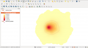
For visual impression I like to see some indicators where the values change. Therefore I am using the Contour function in the Raster dialog. The contour creation function is part of the GdalTools plugin by Faunalia. Well the name Contour is a little critical. Basically this function takes a raster image and creates lines of identical values. In our case it is the point density. Go to Raster->Extraction->Contour:
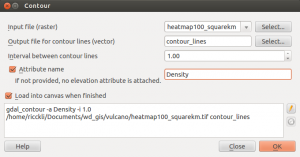
The interval is set to one and I also would like to have a new column in the line shape file where the value of the current line is stored. The results are better to interpret afterwards. You can easily see the slight right orientation of the data:

Nice tutorial, thanks!
Forgive me, but could elaborate on why you chose 564 to represent a square kilometer if your coordinate system was in meters?
because the area of a circle is defined by A= pi*r^2. furthermore one square kilometer is 1000m * 1000m and 3.14*(564m)^2=999’328m^2
Hi Riccardo, I hope this blog is still active.
I am creating a heat map to measure number of farms per square kilometer.
The heatmap plugin of QGis 2.12.3 does not have the option meters for the radius. Only layer units and map units, so how to i calculate the density for each category. e.g. very red is 2 farms per square kilometers, orange is 1 farm per square kilometer and white is 0 farms per square kilometer.
I’m really stuck in this it would really help me out.
layer units might be meters if your data is in EPSG 3857 and in ° if it is in EPSG 4326. Just reproject your data to be in a meter based coordinate system (like UTM or this Web Mercator 3857) and choose your radius in layer units. This is then the desired “meter”. If you need 1 sq kilometer than you need to get the raidus of a circle of 1sq km. which is the mentioned 564m
hey Riccardo, thank you for you tutorial
i want to create heat map for species density but the problem that i will have the same species in the same area represented by more than one point (depends on their existence) how can avoid this problem? i want only to know the biodiversity richness in the area
thank you in advance
Hi, I need some help with QGIS! I have this situation: is there a way to represent densities within a polygon? I am working with cases of cancer in a small town, and I don’t want to make the location of the cases public. So it would be very useful if I could show with colours in a coropleth map, the density of the cases in every block of the town. (I hope my question is clear, English is not my first language!) Thank you so so so much
Hi Victoria, thanks for your comment. In the above example you’ll only get the density map and you cannot get exact point locations from it…
Hi Ricardo! You answered really quickly, I wasn’t ready haha! I know this shows densities, and it’s a very useful tool I will definitely use, but I’m also looking for something that looks like this (this, I did in ArcGIS online for a MOOC). I haven’t explored all the options in QGIS, but maybe you have a better answer for this. It’s the function “aggregate points” in the menu of “summarize data” (In arcgis online, I mean). There must be a way, right? Thanks!
thank you for this! That is an awesome idea to use contour lines to help show intervals. Cheers!